Executive summary
The talent was never the problem. The first impression was.
Resilient Coders trains software engineers in Boston and Philadelphia and connects them with employers. The engineers are strong and the alumni network is large. But when a hiring partner looked the organization up, they landed on a nonprofit website written for students and donors.
That first impression set the terms. Partners heard "nonprofit" and "underserved" and assumed they could offer less. The team told us this on the first call, and everything we found in discovery confirmed it. So we treated this as a positioning job with a website attached. We gave the hiring side its own name, its own domain, and its own look. Then we built the site around one thing: letting a hiring manager see the engineers before anything else.
The result is a talent directory with full profiles, three clear paths that all lead to one conversation, a bold visual system, and a content setup the team updates from a spreadsheet without calling a developer.
The project in numbers
20
weeks. Kickoff in July 2025 to a soft launch in early December.
3
paths into the site: hire talent, see their work, upskill a team. One intro call at the end of each.
35
fellow profiles live in the directory when we captured the site.
8
content collections the team manages: fellows, case studies, events, testimonials and more.
5
HubSpot forms. Every inquiry lands in the CRM the partnerships team already uses.
Part one · Strategy
The pressure: brilliance, discounted at the door.
Chapters 1 to 6. What the team was up against, what we learned before designing anything, and the calls we made about audience, structure, and the name.
Chapter 01 · Strategy
The problem
The engineers were being judged by the website, not by their work.
Resilient Coders had one website doing three jobs. It recruited students, raised money from donors, and tried to win over employers, all from a homepage written for the first two.
On our first call, the executive director put the cost of that plainly. Partners arrive, read that the organization serves underestimated communities, and conclude they can pay the engineers less. The partnerships lead heard the same bias on her outreach calls. The operations lead added a second pressure: some employers were nervous about public scrutiny of diversity hiring. They wanted a partner-facing place that simply showed capable engineers. That left one question for the whole project:
How do we get a hiring manager to see the engineer before they see the cause?
There was a practical problem too. The existing Webflow site was a purchased template the team struggled to edit, and the only developers on staff were busy teaching.
What we had to work within
- A separate homeA new domain with none of the nonprofit site's language.
- WebflowThe platform the team already ran and partly knew.
- HubSpotEvery inquiry had to land in the CRM they already ran.
- A busy teamCopy, headshots and testimonials would arrive between cohorts.
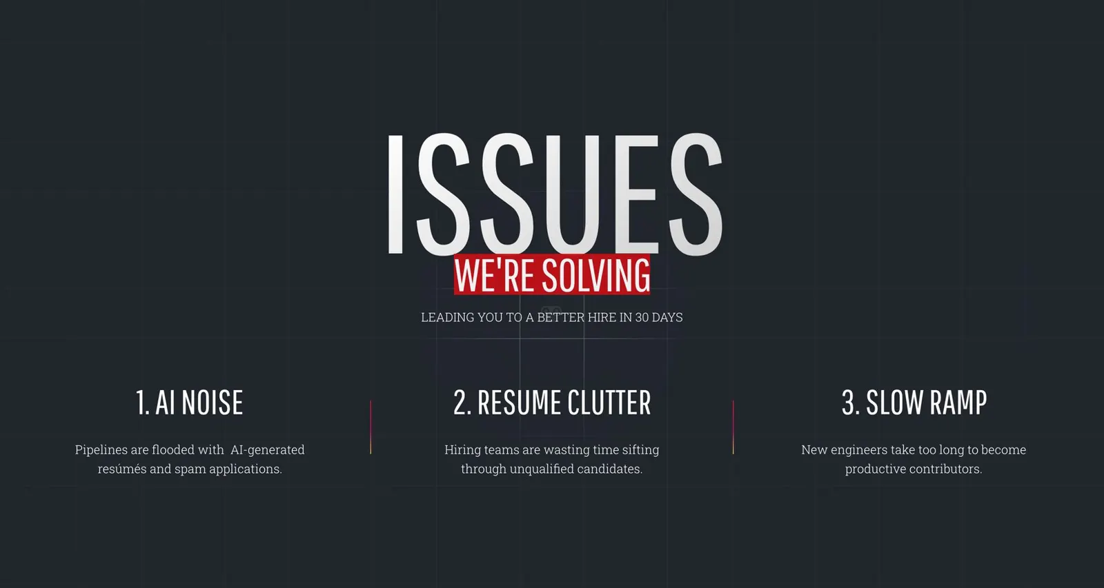
In production · the site now opens its case with the hiring manager's problems, not the organization's story
Architect's note
The brief was a hiring website. The real job was changing what a hiring manager assumes in the first three seconds.
Chapter 02 · Strategy
Discovery
Before designing anything, we needed to hear what the team thought a successful site looked like.
Discovery started with our intake form. The operations lead filled it in on July 15, 2025. It asks what sets an organization apart, who the site has to attract, what a good outcome looks like, and what to avoid.
The answers were specific. The audience was CTOs, CIOs, engineering managers and recruiters in Boston, Philadelphia and New York. The site they admired was CodePath's employer page. They wanted a searchable directory, booking and contact forms, video, and a newsletter signup. One answer mattered more than the rest:
"We want our site to not look cluttered. Focused solely on the hiring aspect."
We followed the form with weekly working sessions with the operations and partnerships leads. Those turned into a short document covering the site's purpose, timeline, deliverables and page structure. We wrote it before looking at a single competitor.
What we carried forward
- First-time visitorsMost people arriving will be skeptical and new to the organization.
- Proof over explanationFaces, skills and employers do more than mission copy.
- The team runs itStaff will add every future fellow and event, not a developer.
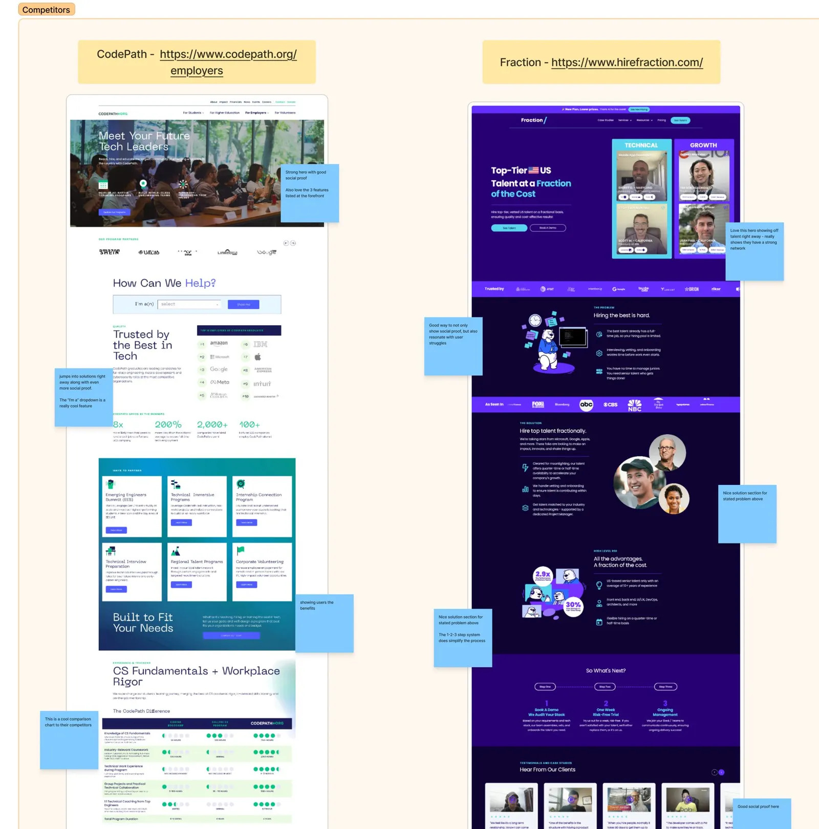
From the working files · Competitor audit, August 2025
Five platforms, captured top to bottom and marked up line by line.
Blue notes for what to borrow, pink for what to avoid. This board settled three arguments in one session: lead with the talent, show employer logos as proof, and keep the path to a conversation short.
Chapter 03 · Strategy
What other talent sites were doing
There was no old hiring site to audit, so we audited everyone else's.
We captured five talent platforms top to bottom and marked them up together: CodePath, Fraction, YearUp United, Braven and Deephire.ai. The pattern was clear. The strong sites opened with people and proof, then got to the point. The weak ones were long and cautious, and it was hard to tell what they wanted a visitor to do.
| What we saw | What we did with it |
|---|---|
| Strong heroes with proof | A face, a claim, and the logos that back it up. We opened the same way. |
| A way to browse talent | Fraction let employers see candidates right away. That became our directory. |
| Long, safe pages | Most sites buried the offer under mission copy. We kept ours short. |
| Unclear next step | Several had competing buttons. We chose one: book an intro call. |
What the team asked us to keep
- A list of skillsA clear, scannable list of what the fellows are trained in.
- Employers up frontThe companies that hire from the network, shown early.
- Three simple stepsA "how it works" a recruiter could repeat to a CTO.
One more detail stood out. Fraction was the only one built on Webflow. The rest ran WordPress or custom systems. That told us the platform could carry what we had in mind.
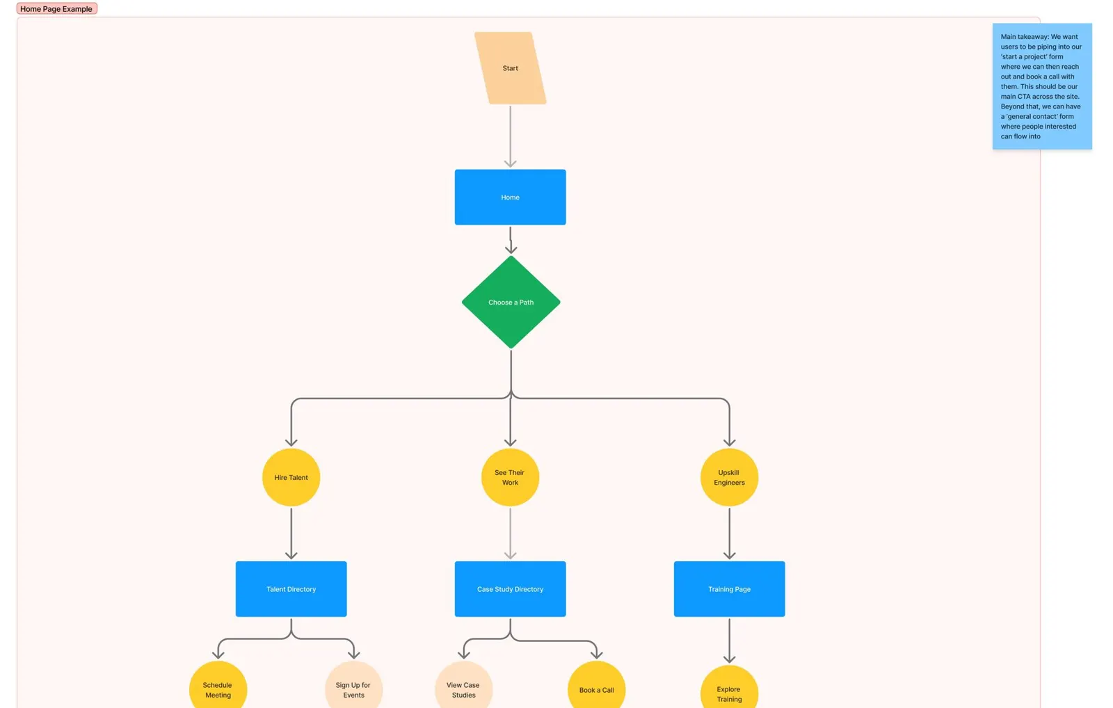
From the working files · User flows, August 2025
Every path ends at Book a Call.
Three paths sounds like three websites. It isn't. It's three headlines above one directory and one form, which kept the build small and the message sharp.
Chapter 04 · Strategy
Who the site is for
The site talks to one kind of person: the one who signs off on a hire.
That means CTOs, CIOs, engineering managers and recruiters. They are busy and data-driven. They want to know exactly what they're getting before they engage, and they still need a reason to keep reading.
We found three reasons someone like that would show up, so we drew three paths. All three end in the same place.
- Arrive
- Choose a path
- Directory · Case studies · Training
- Look closer
- Book an intro call
Hire talent
A recruiter with an open role. They want a searchable pool and a way to reach a person. They land in the directory.
See their work
An engineering manager who trusts code over claims. They want real projects and a demo. They land in the case studies.
Upskill a team
A leader with an existing team and an AI gap. They want a schedule and a format. They land on training and events.
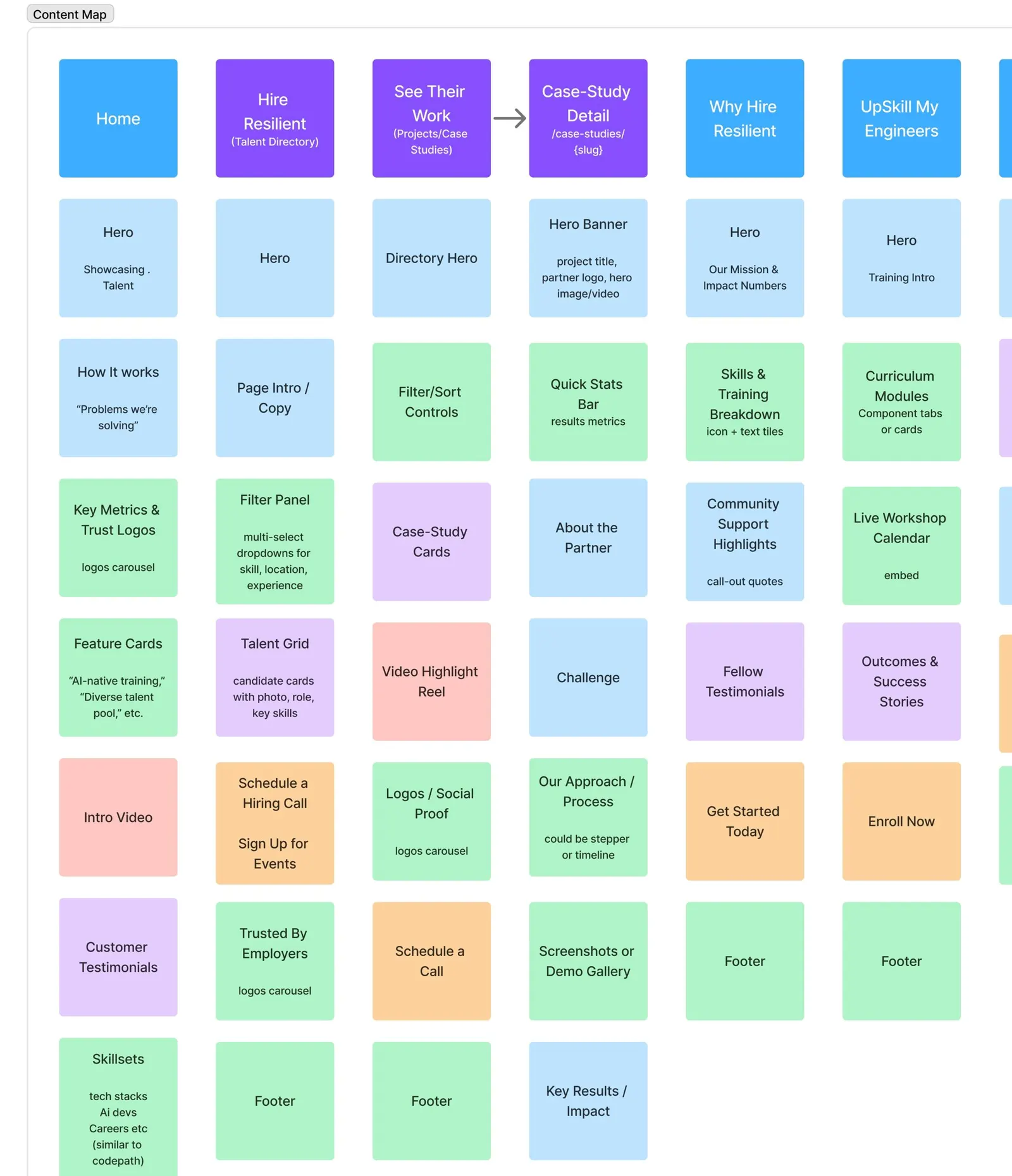
From the working files · Content map
If the team will update it every month, it should be content, not layout.
Every block was labeled as a card, a full-width band or a grid, and we noted where its content would come from.
Chapter 05 · Strategy
Content mapping
The build got easier once every block on every page had a job.
Before wireframes, we mapped each page section by section. We started with eight pages: Home, Hire Resilient, See Their Work, Why Hire Resilient, Upskill Engineers, Our Team, a thank-you page, and the utility pages.
The map already showed which sections would be managed in the CMS. That is why development later felt like assembly.
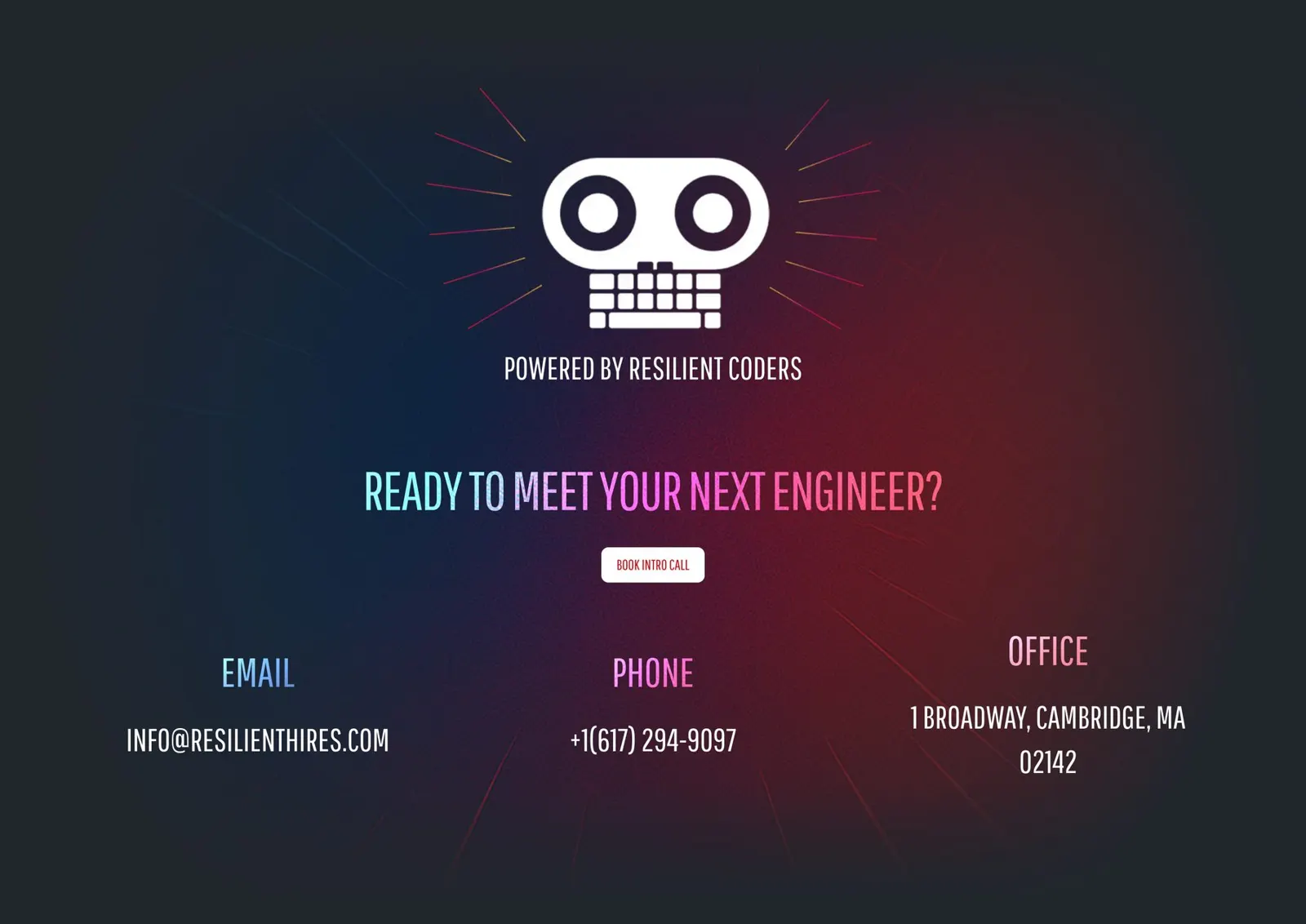
In production · The header and the closing section
A credit, not a headline.
The new wordmark, five links, and one button up top. At the close, a small Powered by Resilient Coders credit sits under the mark.

Chapter 06 · Strategy
The name and the two sites
A new name did half the repositioning before anyone saw the design.
The project started as Resilient Talent. It became Resilient Hires, a name that says what a hiring partner does. The operations lead registered resilienthires.com in late October 2025, and the homepage wordmark changed to match in December.
After launch a new problem showed up. Partners asked, "I thought this was Resilient Coders?" Two brands needed a clear relationship.
Two sites, two jobs
The .org recruits students and raises money. Resilient Hires sells talent to employers. Hiring pages on the old site now point to the new one.
Powered by Resilient Coders
We added a small credit above the hero and in the footer, both linking to the .org. We softened it twice in review until it read as a credit, not a headline.
Logos by permission
Companies must approve their logo, and some legal teams said no. The strip says who has hired, and it grew as approvals came in.
Search, split in two
Resilient Hires targets people looking for talent. The .org keeps the organization's name and story.
Part two · Design
The shaping: strong and powerful, blended like a choir.
Chapters 7 to 10. The mood board that set the tone, the design system, the first design that failed and the one that worked, the homepage, and the talent directory.
Chapter 07 · Design
Creative direction
Sites in this category look the same because everyone plays it safe. We went the other way.
Our first mood board was screenshots from the audit, and it wasn't hitting the bar. So we looked outside the category, at art.
We landed on bold minimalism from the graphic designer Zeka: one photographed subject, surrounded by oversized type that stands on its own. For color we looked at Across the Spider-Verse, where loud colors and abstract styles blend without overwhelming.
Everything strong and powerful, but blended like a choir. That's the talent Resilient Coders produces, so it became the site.
One subject, big type
A single portrait with headline words that catch the eye. It shaped every heading on the site.
Color that blends
Red, blue, purple and gold layered so a page reads as one piece.
Dark, then loud
A dark base makes the red sections land harder.
Chosen in one sitting
The operations lead picked this direction on August 5, 2025: "I do really like this bold minimalism thing."
- Bold
- Editorial
- One subject
- Dark, then red
- Type as image
- Never generic
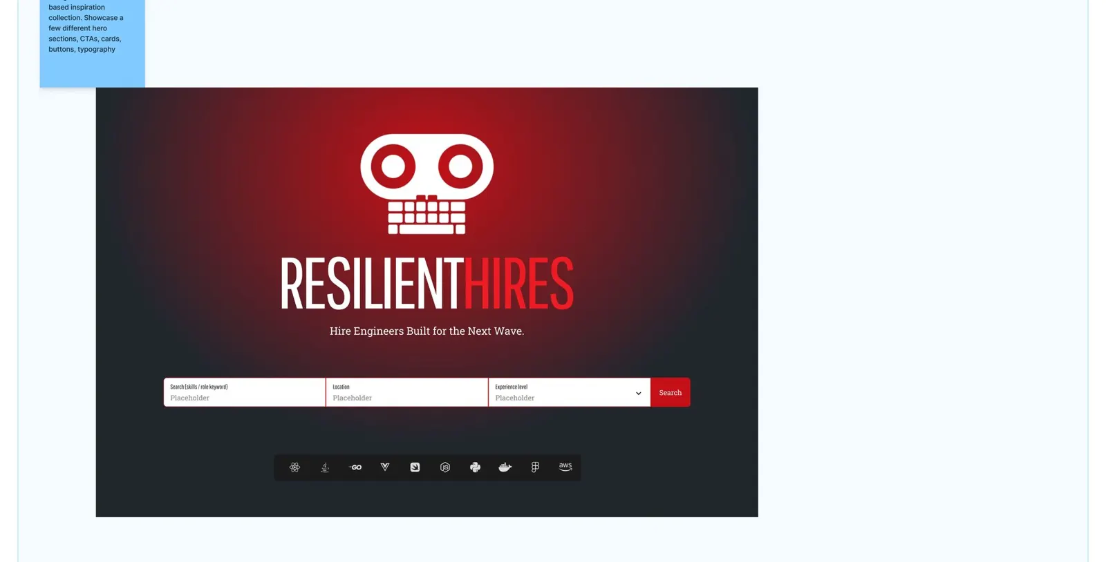
From the working files · the first hero ideas, testing the direction before any component existed
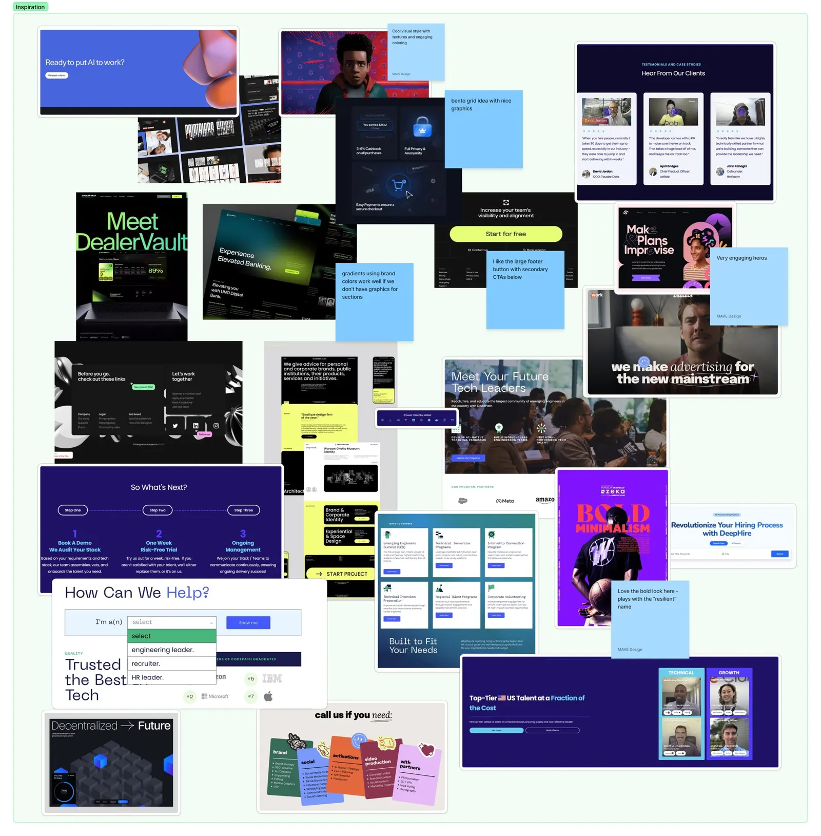
From the working files · Mood board, August 2025
The board that gave us permission to be loud.
Dark interfaces, grids of cards, and one-subject layouts, with our notes on what to take from each. One of them reads: "love the bold look here, plays with the resilient name."
Chapter 08 · Design
Design system
We built the visual system before building the pages.
The fonts and colors were inherited: Pathway Gothic One for headings, Roboto Slab for body, a bright red and a bluish black. Our job was to make them feel premium and still familiar.
The rules
- Type. Tall, condensed headings. A slab serif for reading. Sizes set once, for every screen size.
- Buttons. Always the opposite of their background. Blue ground, red button. Red ground, light button.
- Grid. A faint grid behind every dark section, so cards feel placed, not floating.
- Parts. Video sections, grids, hero layouts, testimonial cards, scrolling tickers, event blocks.
We built the guide on the MAST framework, a naming system for Webflow. Every style in Figma had a matching class and variable in Webflow before the build started.
The goal was simple: make designing in Figma and building in Webflow the same conversation.
Type, color and components, decided once.
Three frames from the guide. Every heading, swatch and button here has a twin in Webflow with the same name.
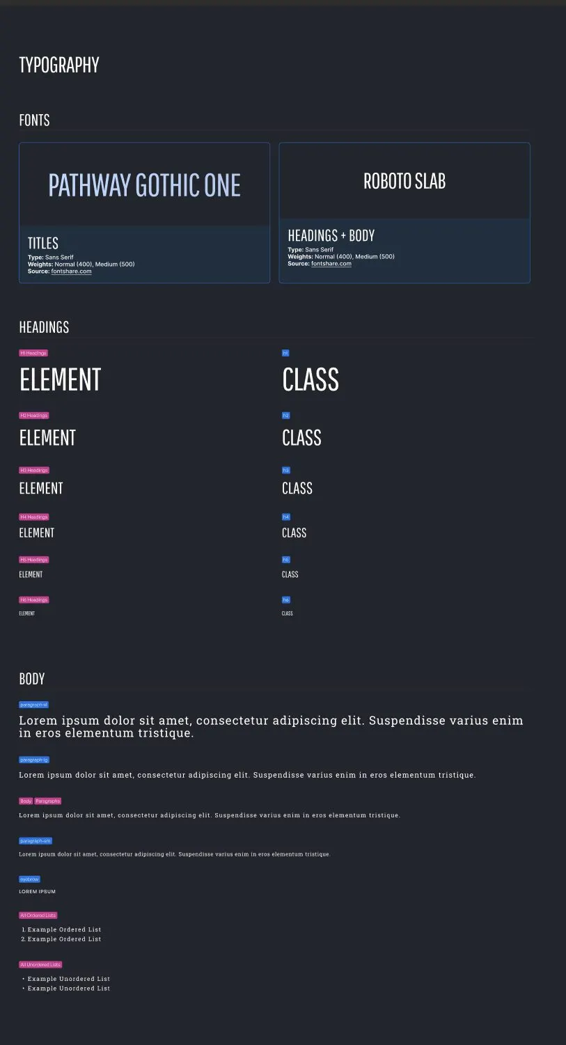
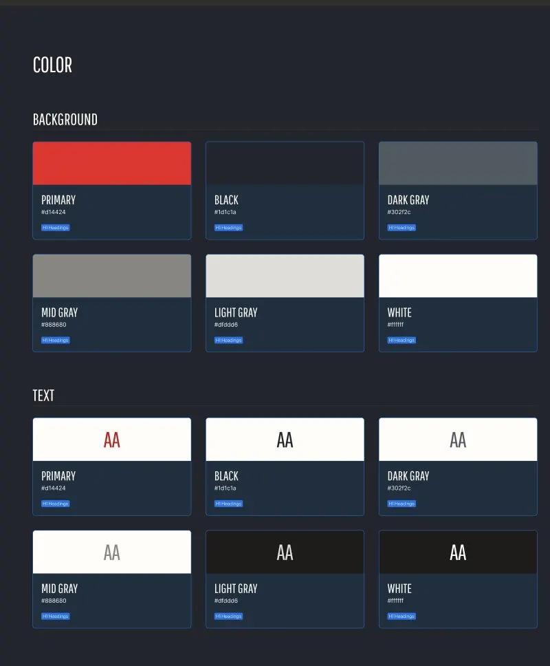
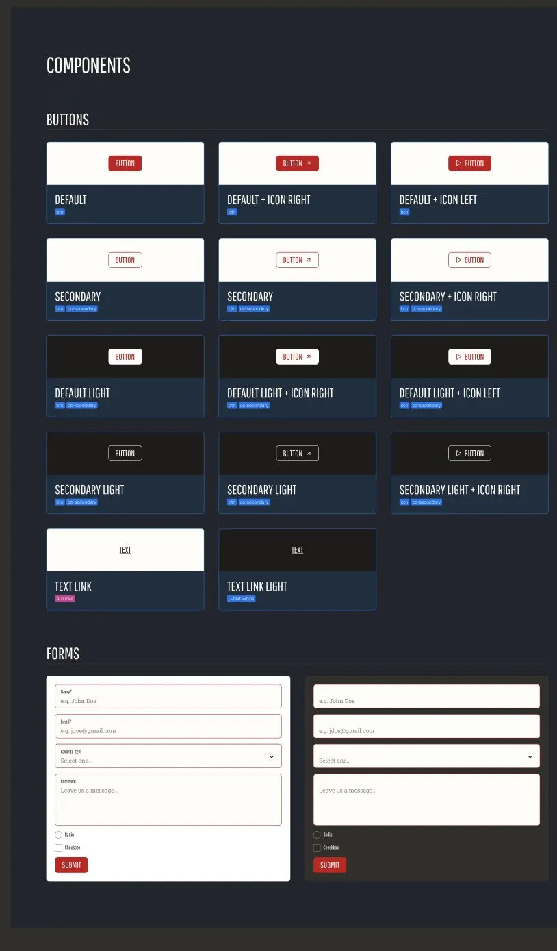
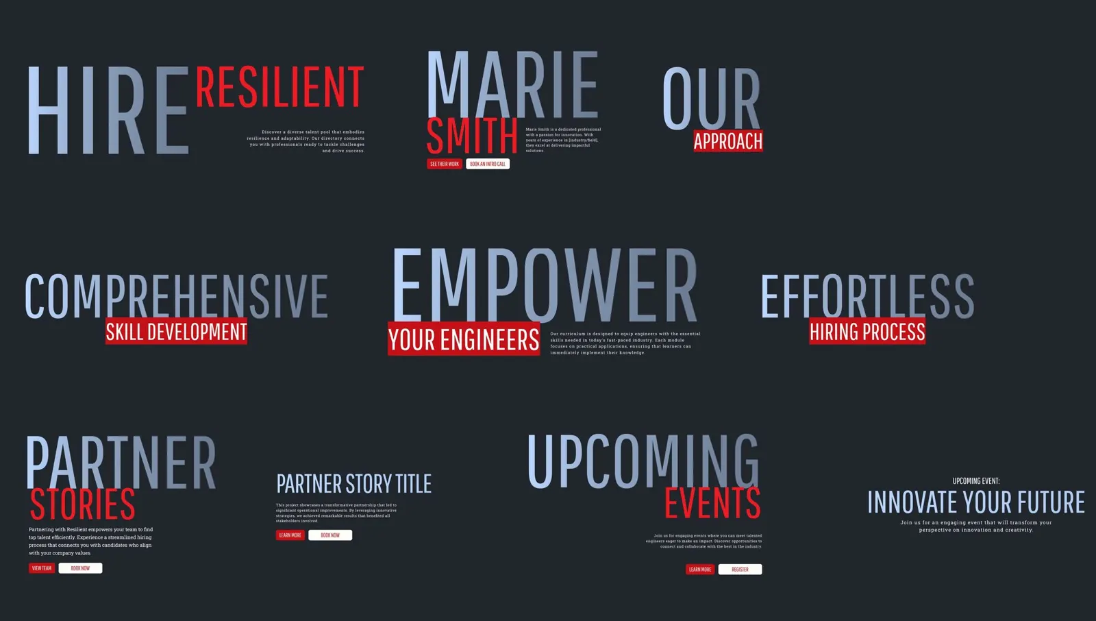
The heading styles: nine ways to pair one big word with a supporting phrase
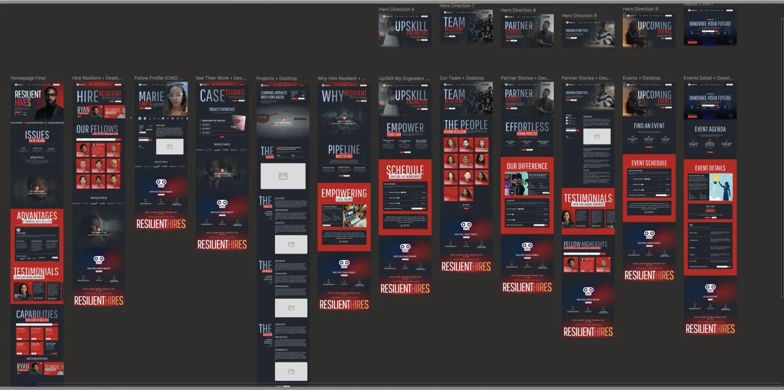
From the working files · Every page in Figma, from the homepage to event details
With type this bold, the biggest change from wireframe to final was taking things away.
Chapter 09 · Design
Finding the design
The first polished design failed in one review. That failure gave us the idea that made the site.
We moved fast from the content map to wireframes, using Relume for a clean starting point. The team reviewed every page on August 12, 2025. Their notes were direct: move the fellows and the search bar higher, show employer logos as proof, and simplify the case studies.
Then came the first polished design. It had large text, gradient backgrounds and heavy graphic icons. It distracted more than it helped, and it looked like the main Resilient Coders site in dark mode.
| Direction | What it did | What we learned |
|---|---|---|
| Direction 1 | A centered mark and a search bar. | It put the tool first and the people second. |
| Direction 2 | A split hero with a portrait and a stat line. | Closer, but the icons and effects fought the type. |
| The magazine (chosen) | Very large headlines, one bold word per section. | A visitor can scan ISSUES, then CAPABILITIES, without reading a paragraph. |
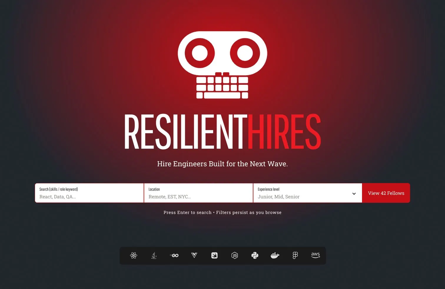
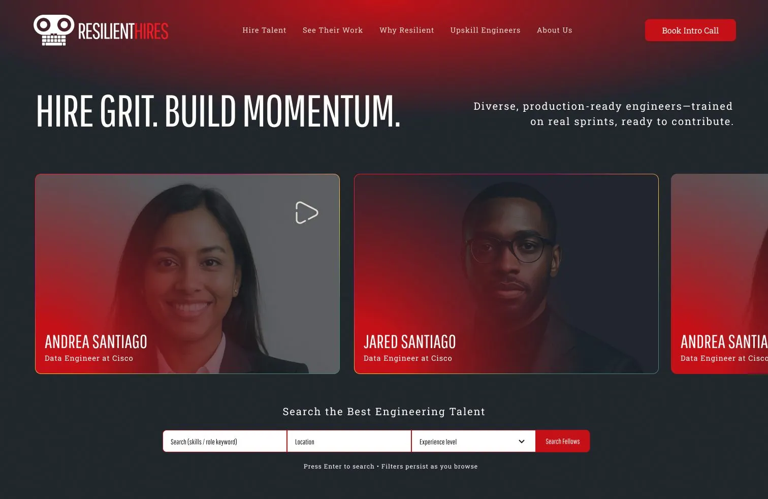
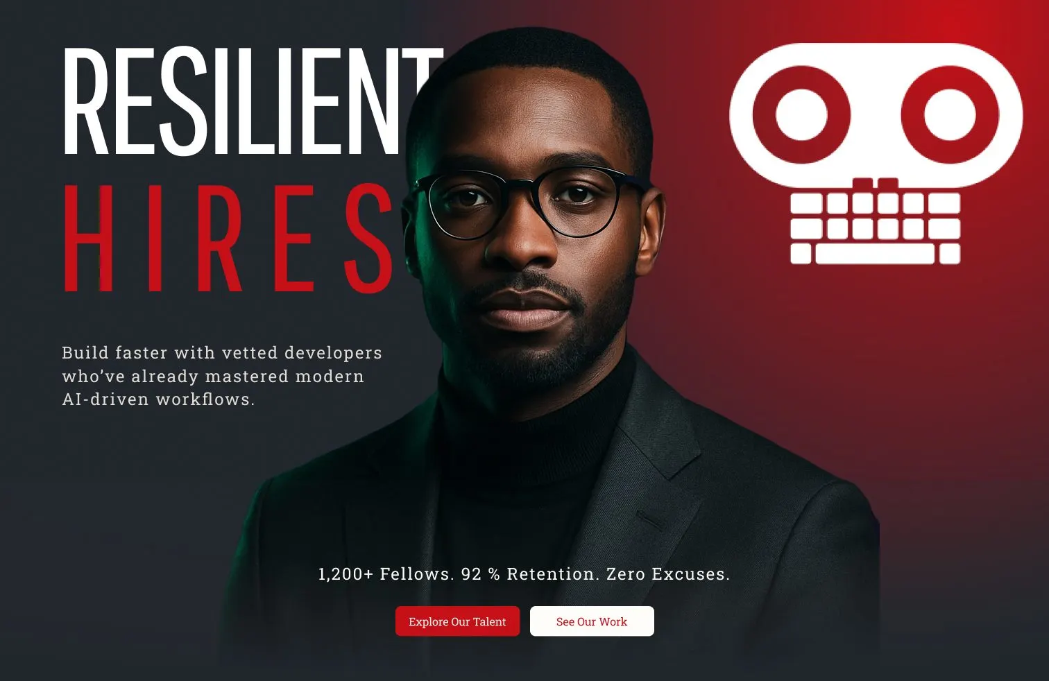
We kept two things the team loved: the multi-color gradient, and the blend from dark into red. Full red sections give the eye a break from the dark background.
In production · resilienthires.com
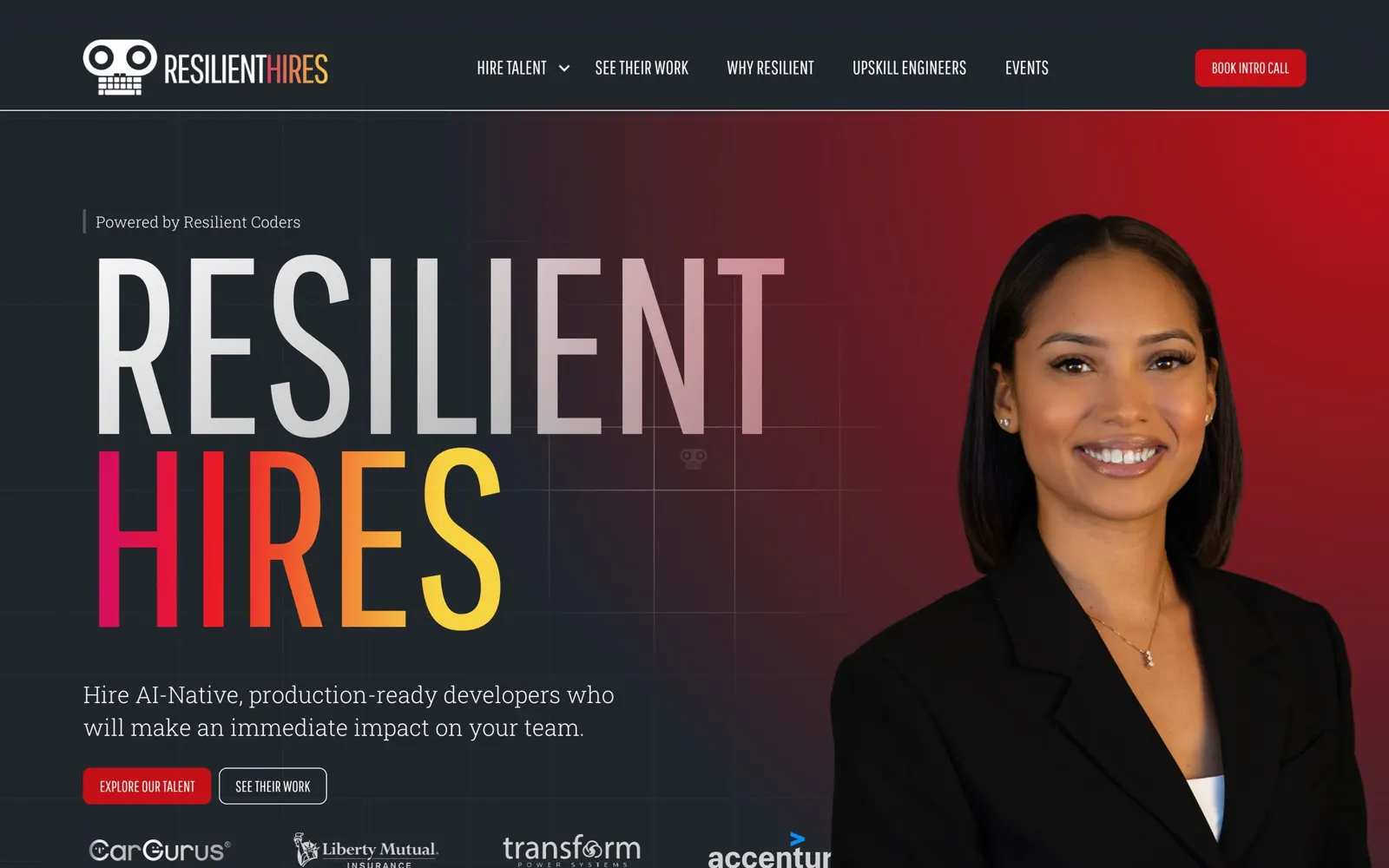
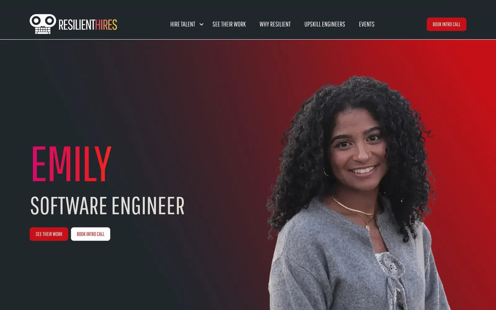
Above the fold: a name, a face, and the companies who already said yes.
Two words in gradient tell a visitor where they are. One sentence tells them the offer: AI-native, production-ready developers. An alum holds the frame, and the companies that have hired sit right below her. Nothing here explains the mission. You can see it.

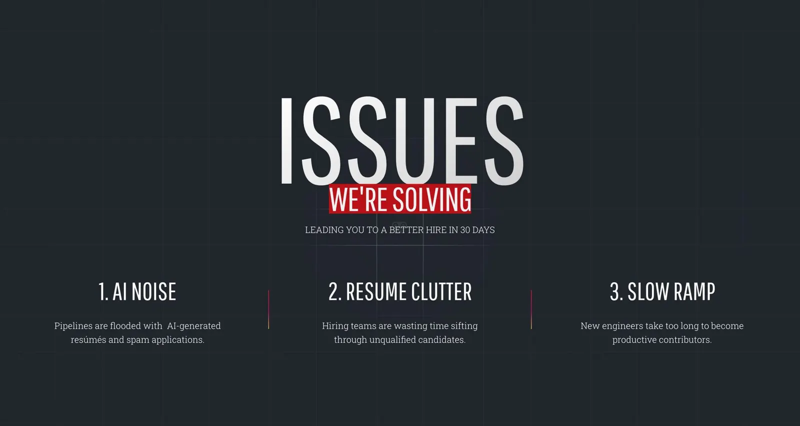
In production · the homepage, section by section
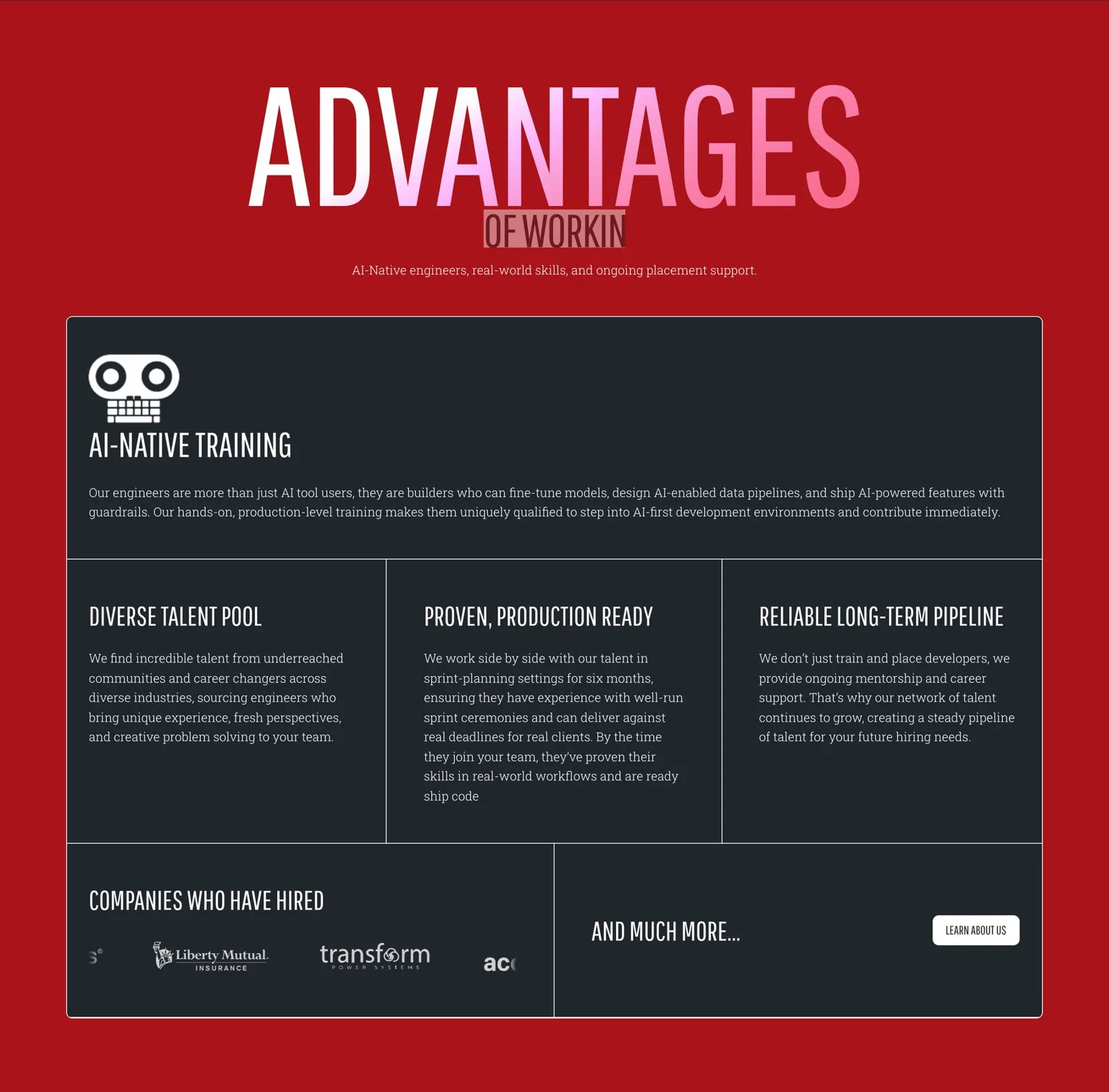
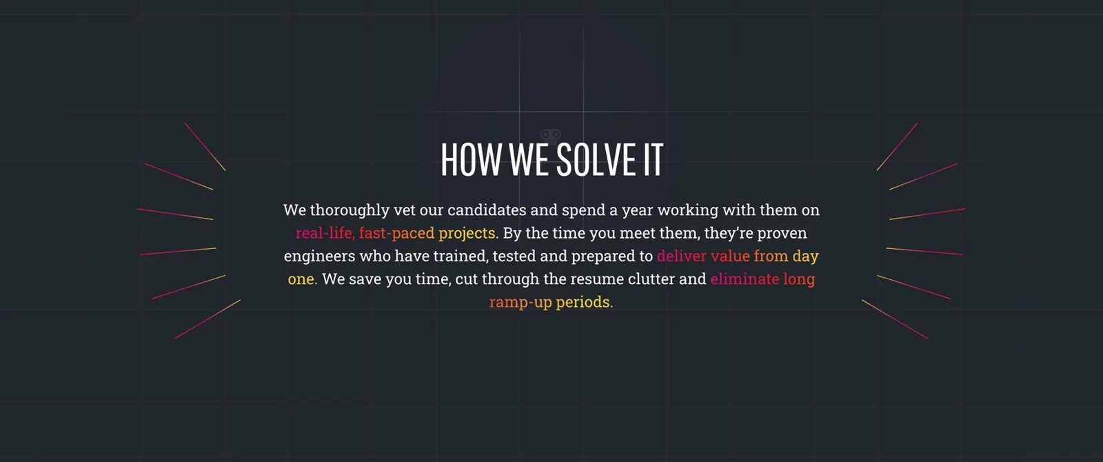
Every section is a headline with a job.
The homepage has to make a hiring manager believe, in one screen, that this is exceptional talent. Then it hands them the directory.
- Hero. The name, an alum's portrait, the offer, and two buttons. Employer logos sit right below.
- Ticker. The network's numbers, scrolling across the page.
- Issues. Three hiring problems the reader already has.
- How we solve it. The three-step system the team asked for.
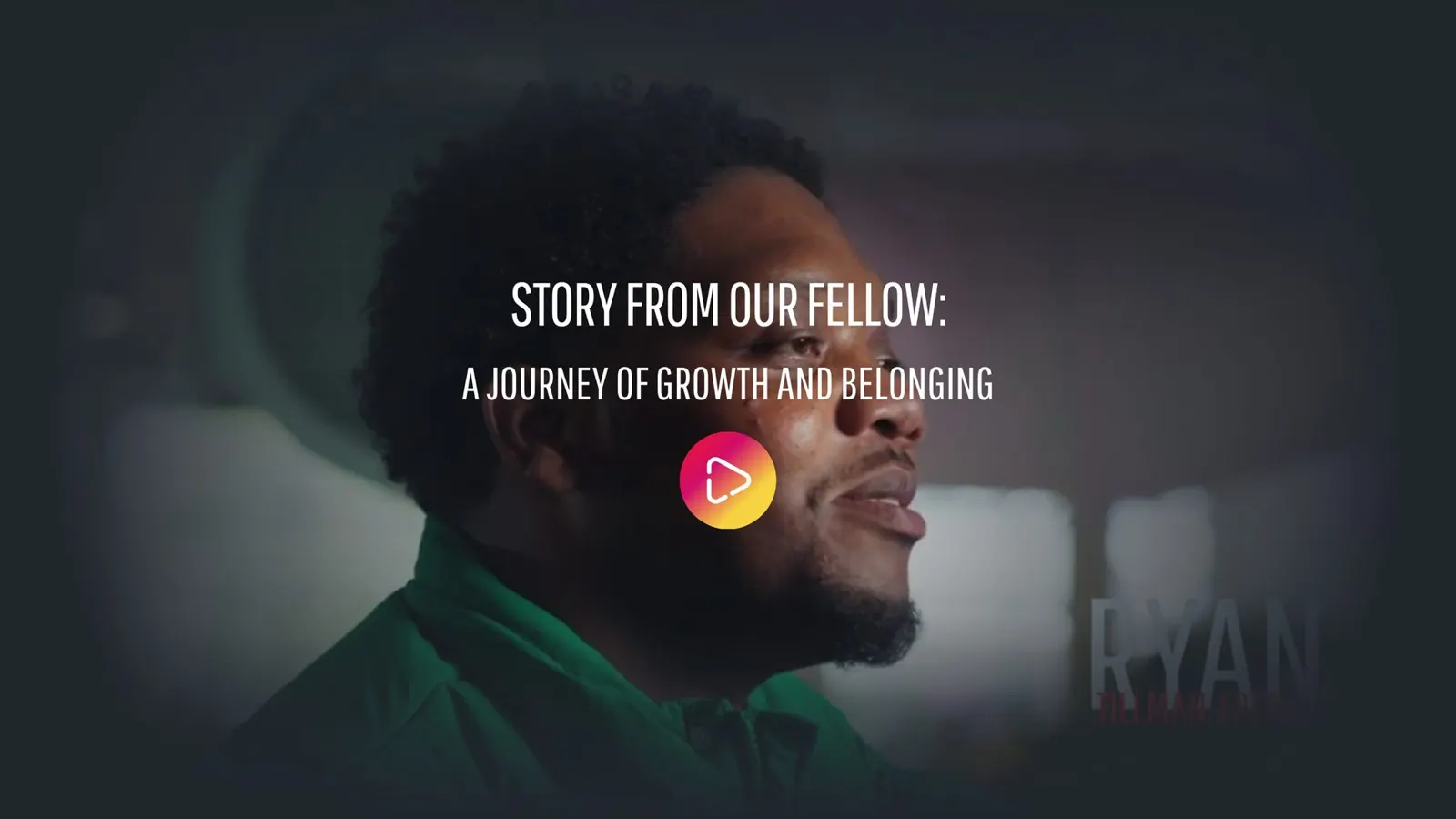
- Story from our fellow. A video portrait. Proof with a face.
- Advantages. The red section: training, talent pool, readiness, and who has hired.
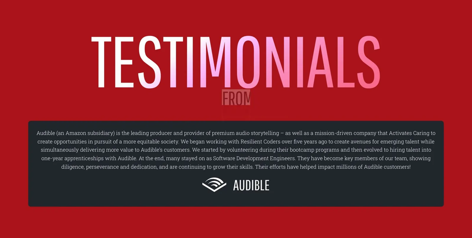
- Testimonials. One at a time, in a partner's words.
- Capabilities. Six skill areas, then recently employed fellows.
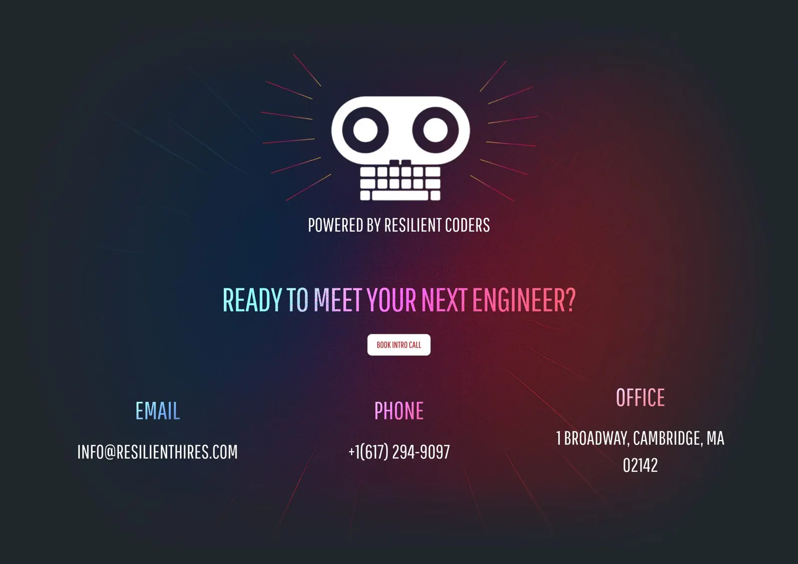
- Ready to meet your next engineer? The only ask, after the case is made.

In production · Homepage sections
Three problems, a red break, then the proof.

Chapter 10 · Design
The talent directory
The directory is the product. Everything else on the site points to it.
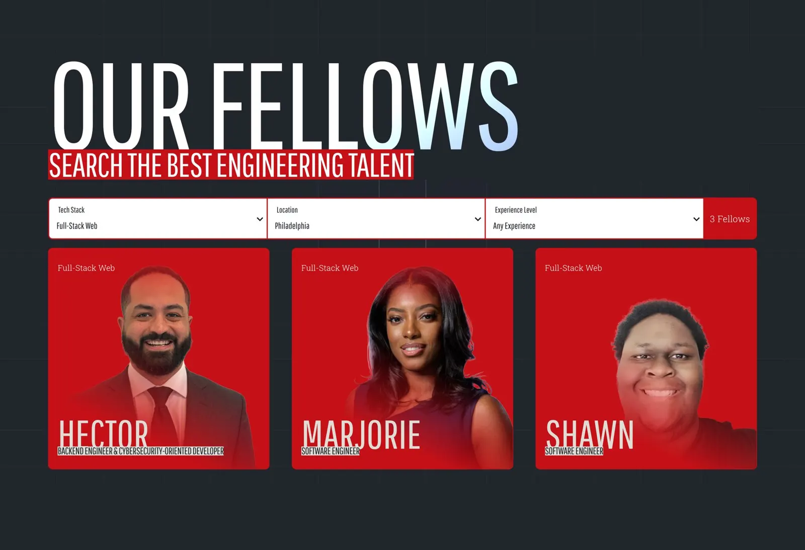
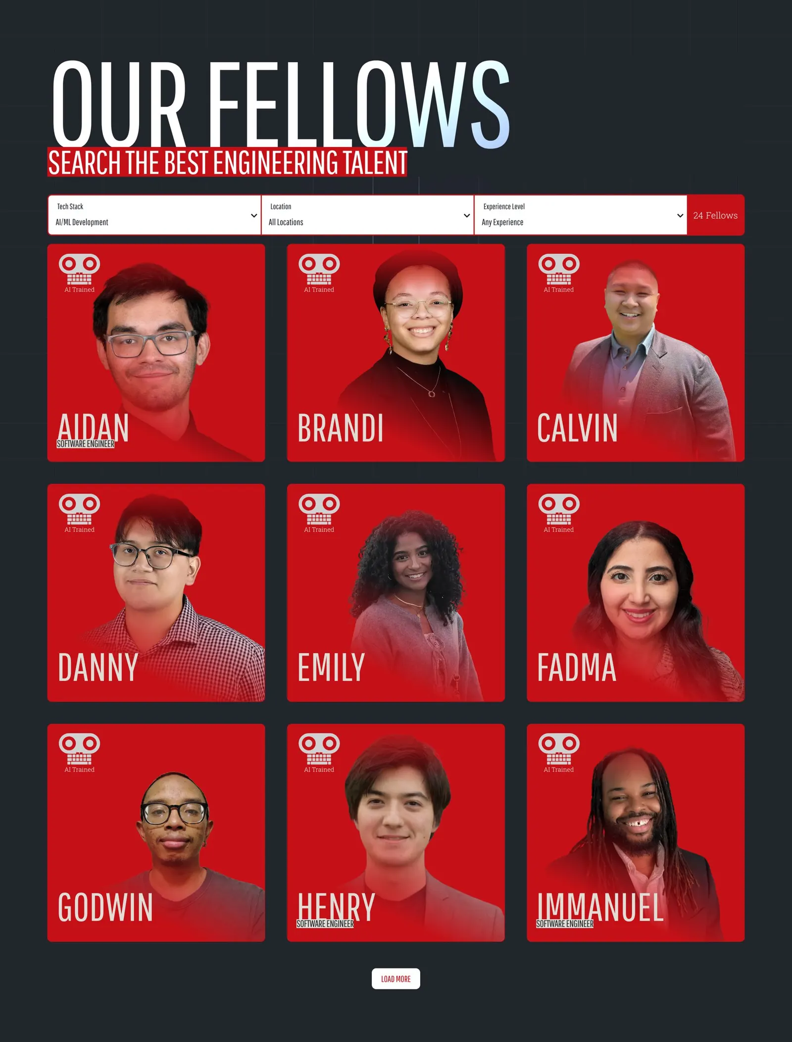
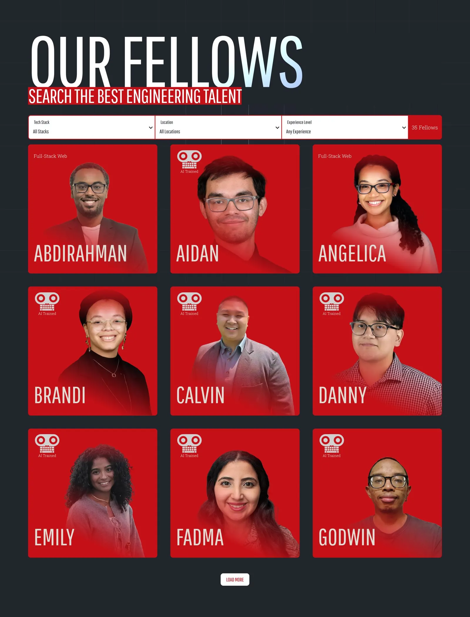
Each fellow card answers three questions at a glance: who they are, what they specialize in, and where they are. We used cutout portraits on bright red cards so every fellow looks like part of one roster.
The filter bar sorts by any mix of tech stack, location and experience, and the count of fellows updates as you choose. Click a card and you get a full profile page. The partnerships lead pushed for that: a small card couldn't carry enough to make a match.
Privacy in the details
We hid cohort years and show experience as a level. The main button became Connect on LinkedIn, so the fellow decides who to talk to.
No login wall
We talked about gating the roster and decided against it. An open directory is the pitch.
One collection, three views
The same fellow list drives the directory, a Demo Day page, and the Recently Employed row on the homepage.
Booking knows the fellow
The Book Intro Call button on a profile tells the CRM which fellow the partner wants to meet.
In production · The directory at work
Filter, count, load more, connect.

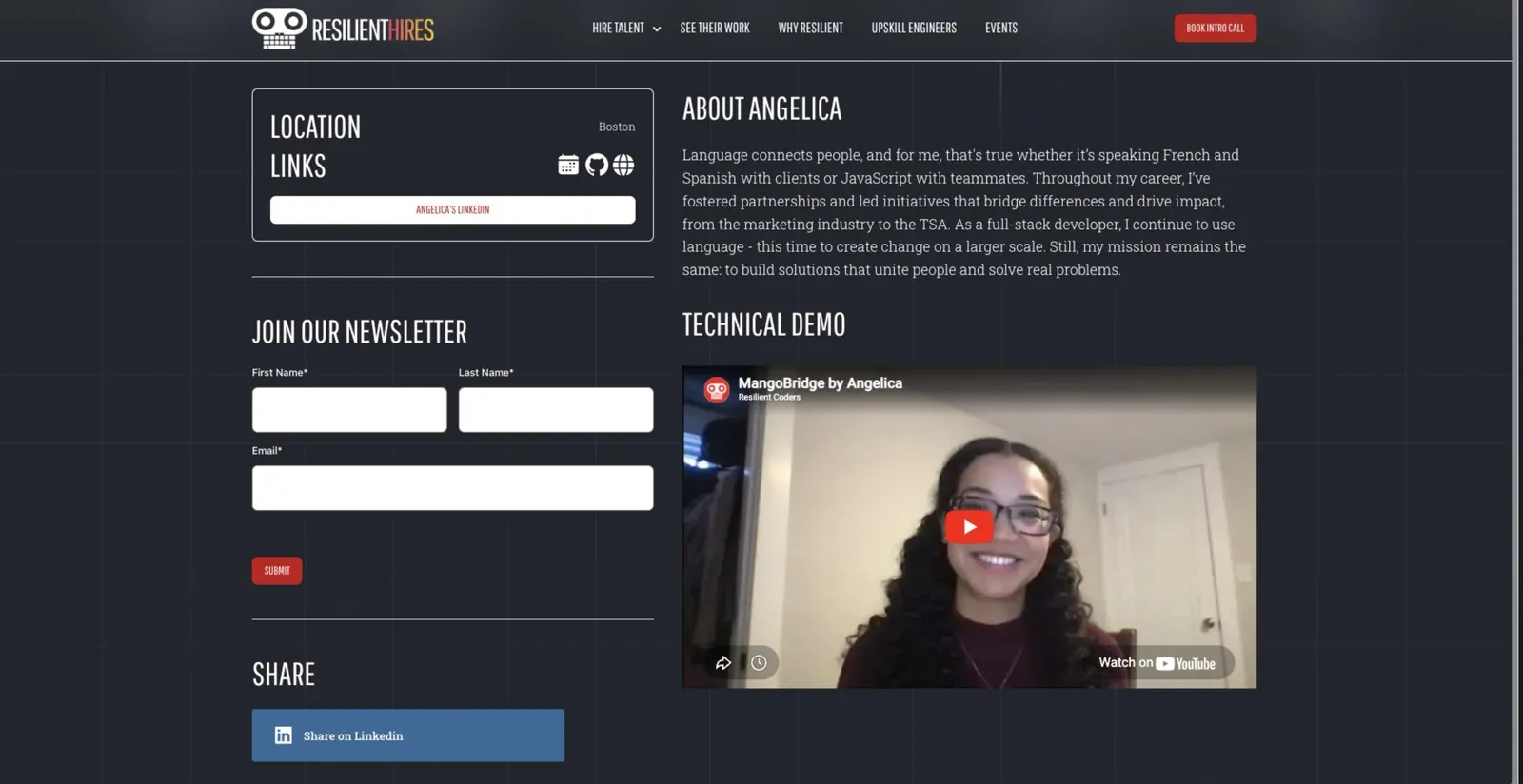
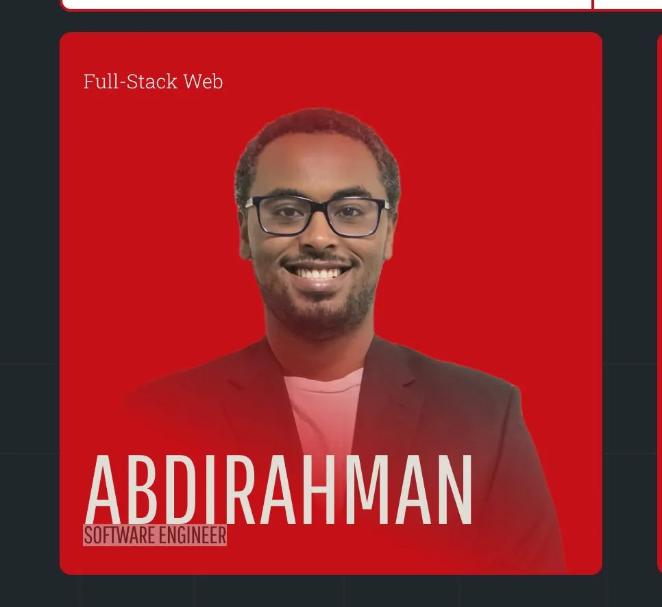
In production · the component system
Pages are assembled from the same set of parts.
Every page is built from shared components that follow the same type, color and spacing rules. A new page looks like it belongs without anyone redesigning it.
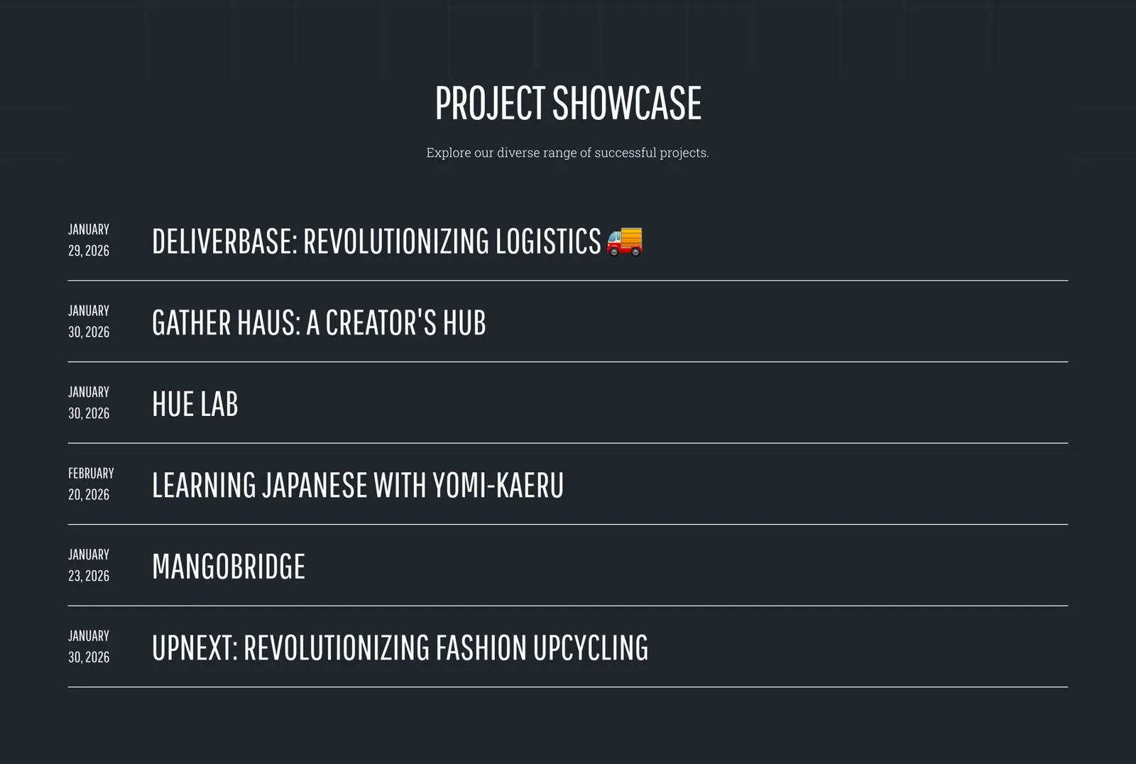
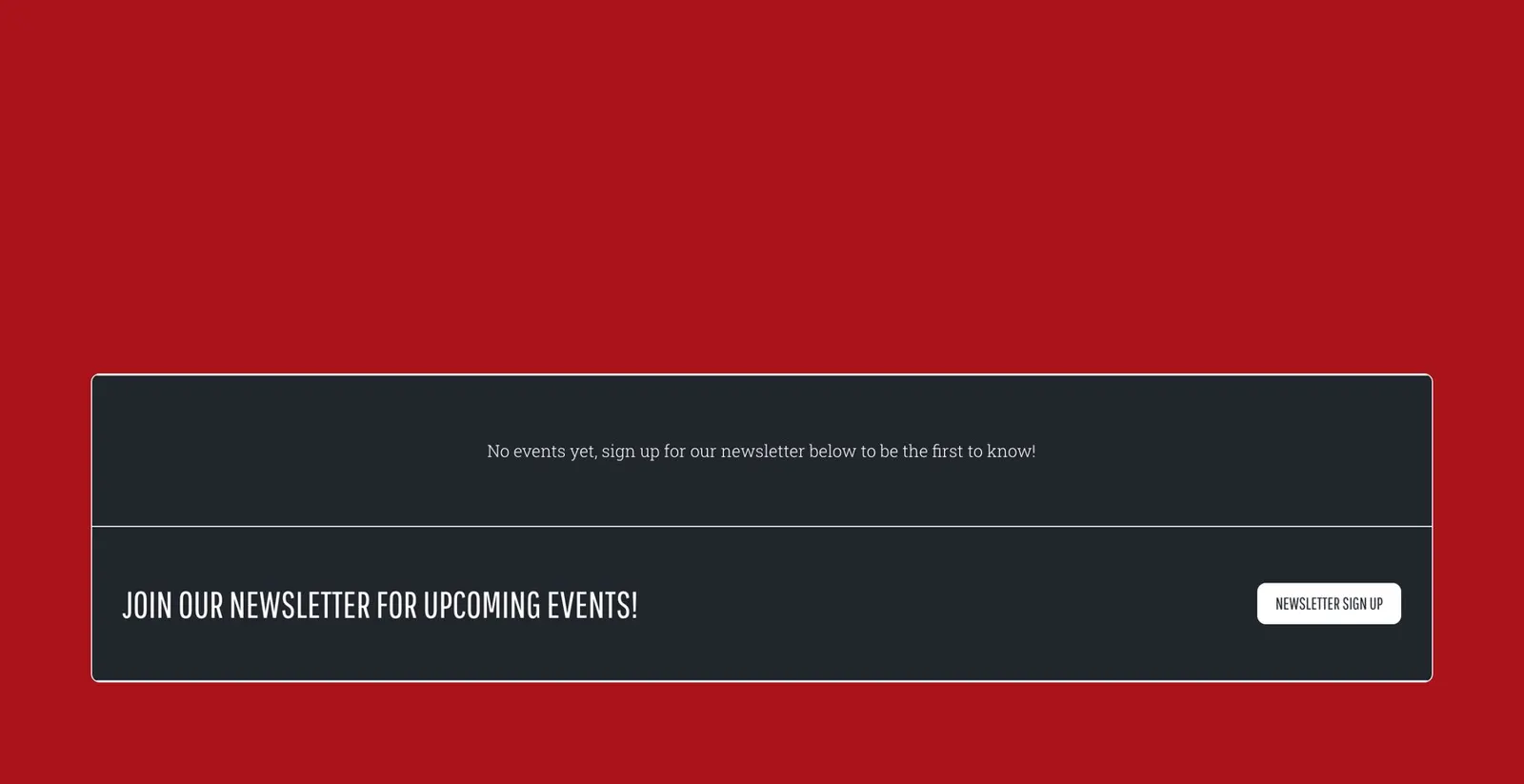
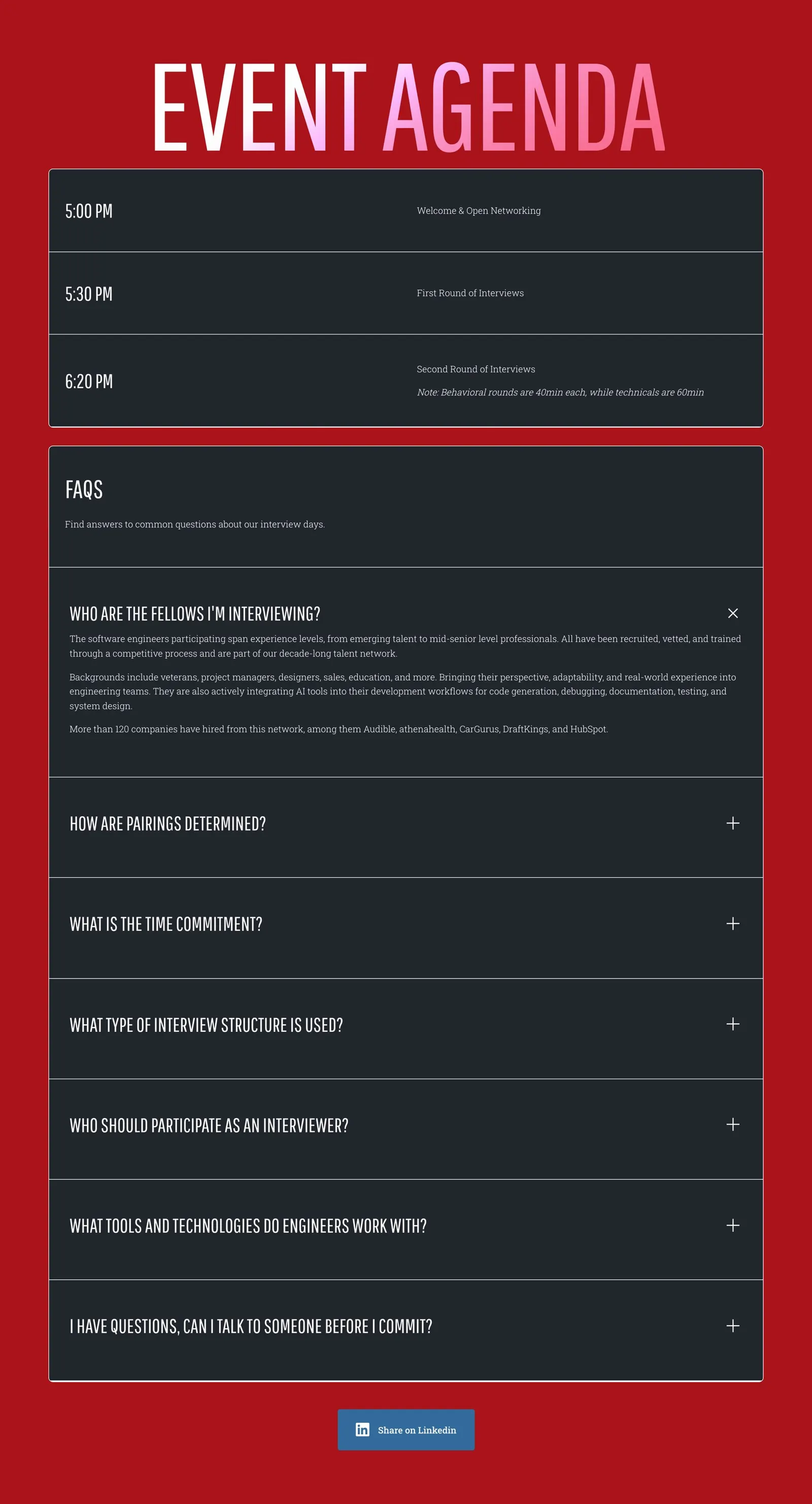
Empty sections hide themselves. If an event has no FAQ or a fellow has no demo video, that block doesn't show. A new entry never leaves a hole in the page.
Part three · Development
The shine: a talent network the team runs themselves.
Chapters 11 to 17. How we built it in Webflow, how the content is managed, the filters, the forms that failed once, the titles that were the hardest part, the launch, and the decisions behind it all.
Chapter 11 · Development
The Webflow build
Webflow was never the question. How to build on it so the team could keep it was.
The team already ran Webflow and had fought with it for years. So the goal wasn't a new platform. It was a build a non-developer could maintain as the brand grows.
We used MAST, a naming framework for Webflow. Every element gets a predictable set of classes, and colors, type sizes and spacing live in shared variables. Change a variable and the whole site follows.
Styles first
We built colors, type and every component into Webflow before the homepage existed.
Then the main pages
Homepage, directory and profile templates came next, using only those parts.
Then the rest
Why Resilient, Upskill, About and Contact were assembled from what already existed.
Honest about access
We set AA color contrast as the target and fixed contrast problems in review. We did not run a formal audit.
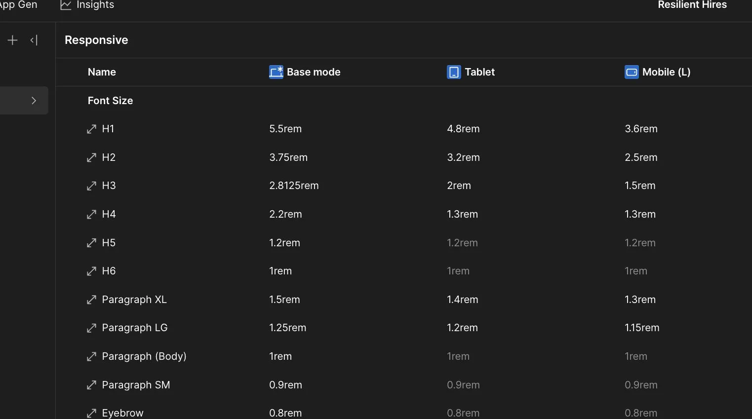
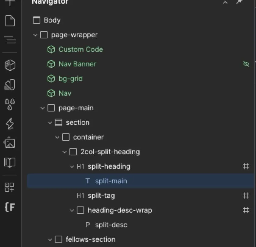
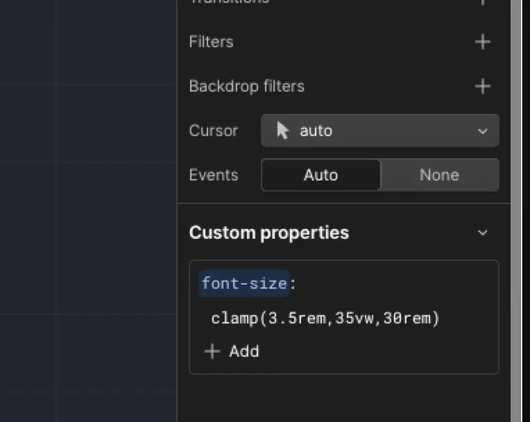
From the working files · heading sizes as variables, one value for each screen size

On the build
It felt like putting Lego pieces together.
Chapter 12 · Development
The CMS
Almost everything on the site is content the team can edit, not layout we have to change.
Fellows, case studies, events, testimonials and tech stacks are all collections, and they point at each other. A case study links to the fellow who built it and the stacks they used. An event carries its own form.
We planned the collections during content mapping, so we built them in a week in October 2025. The first roster arrived as a spreadsheet in early November. The spreadsheet became the source of truth.
Spreadsheet in, site out
The team exports, fills in a sheet, and re-imports. We wrote a template with instructions for it.
A hidden cohort field
We took cohorts off the public site for privacy. Case studies broke when alumni were removed, so cohort came back as a field only staff can see.
Available for work
A single checkbox now decides who shows in the directory, so alumni from any year can be listed.
One headshot spec
Square, transparent background, 2000 pixels. A Figma template produces it every time.
Every time the site tried to guess, something broke. Every time we added a plain checkbox, it held.
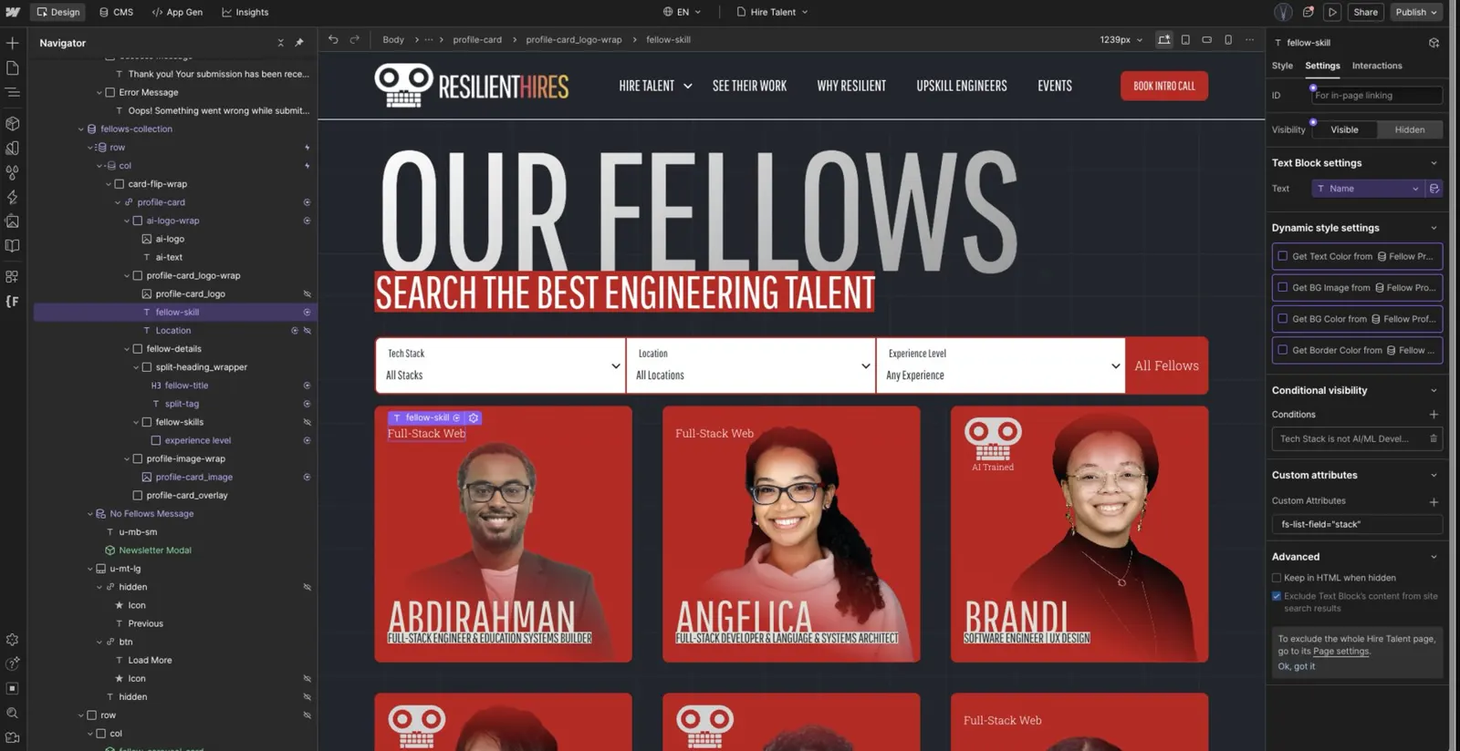
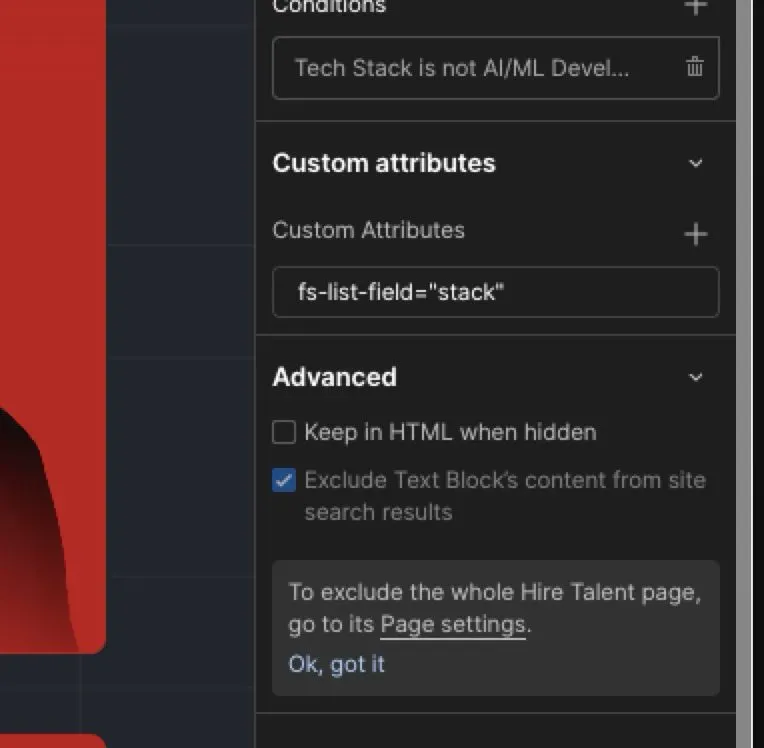
From the working files · The whole integration: one attribute on the element
No custom filter code, and nothing hidden from the team.
We used Webflow's CMS for the data and Finsweet Attributes for the behavior. Finsweet is a small library you switch on by adding attributes to elements.
Chapter 13 · Development
Filtering the directory
The filters had to feel instant and stay simple enough for the team to extend.
Three filters
Stack, location and experience are dropdowns with one attribute each. Adding a filter means adding a field.
A live count
The number of fellows updates as filters change, so 35 becomes 3 the moment you pick a city.
Load more, in place
The page shows a first set of cards and loads the rest on request, so it stays short.
What we fixed after launch
| Problem | Cause | Fix |
|---|---|---|
| Cards loaded slowly | Large headshots, uncompressed | Compression built into the headshot template |
| Third column arrived late | The entrance animation raced the list | Shorter animation, carousel removed from this page |
| Too much above the grid | A carousel and two extra buttons | Removed, so visitors go straight to the fellows |
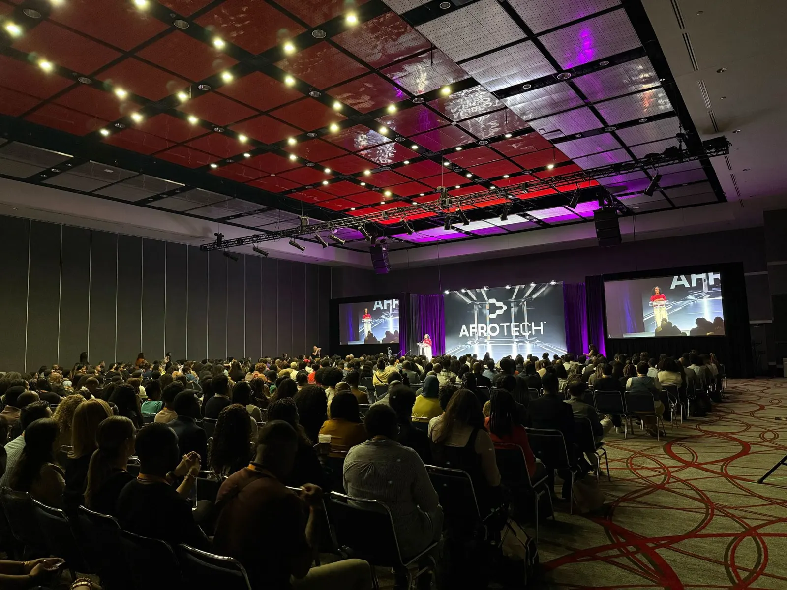
What one silent failure taught us
Now every form we ship gets a test submission that someone on the client's side confirms they received.
Chapter 14 · Development
Forms and tracking
Every form on the site is a HubSpot form, because the lead matters more than the form.
The partnerships team lives in HubSpot. Before design started, we met their HubSpot consultants and settled the plumbing in one call. Webflow's own forms are easier and prettier, but the sync to HubSpot had failed for them before. So we embedded HubSpot forms and styled them to match.
| Form | What it does |
|---|---|
| Newsletter | Tagged by form, so hiring partners stop getting donation emails. |
| Contact | On the Contact page, which doubles as a link the team can share and track. |
| Book an intro call | A pop-up on every page. On a profile it records which fellow the partner asked about. |
| Event RSVP | One form for the 10 to 15 events a year. Staff paste a form ID into the CMS and the form appears. |
| Button clicks | Tracks the main buttons, alongside HubSpot page tracking through Google Tag Manager. |
That event setup means a marketing lead can publish an event page with its own form in an afternoon, without a developer and without a tool like Eventbrite. The original brief called for Calendly. Fellows keep their own calendars, so bookings couldn't be tracked. A HubSpot form and an automated email replaced it.
One thing went wrong. In mid-November the first styled form showed two views and zero submissions, with no error. We rebuilt it line by line with the consultants until test leads landed.
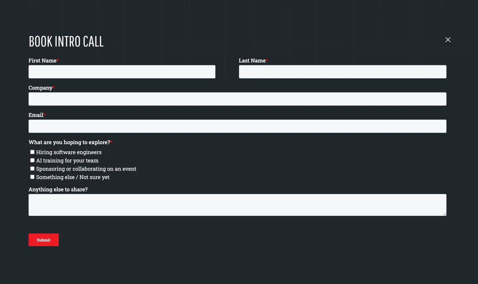
In production · the same HubSpot form as a page of its own
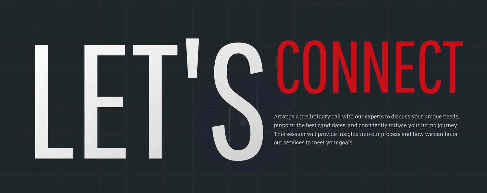
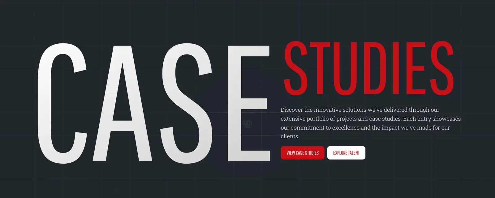
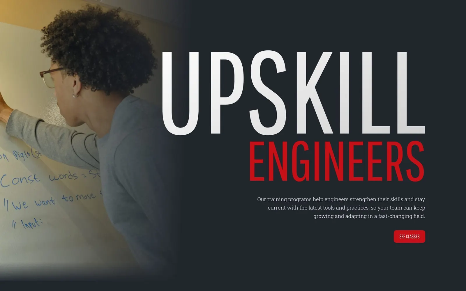
In production · The title system across the site
Nine lockups in Figma became one component in Webflow.
When a brand's identity is its typography, the typography is an engineering problem. It deserved the same care as the CMS.
Chapter 15 · Development
The titles
The hardest thing to build on this site was, surprisingly, the headlines.
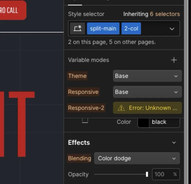
Every section title has a huge main word and a supporting phrase in a different style. Each one blends its color into the background. They had to stay vivid at every screen size and never break the layout.
That's three problems at once. Huge type overflows small screens. Color blending breaks scroll animations. And the team needed to write new titles without calling us. We solved each one separately.
Sizes that flex
Each heading size uses a CSS clamp, which sets a minimum, a preferred and a maximum size. The word fills the space and never spills out of it.
A grid for the parts
The main word, the supporting phrase and the description each sit in their own grid cell, so each can animate on its own.
One component, many layouts
A single heading component with variations: a short bold claim, a long name, or a block of detail. The team mixes and matches.
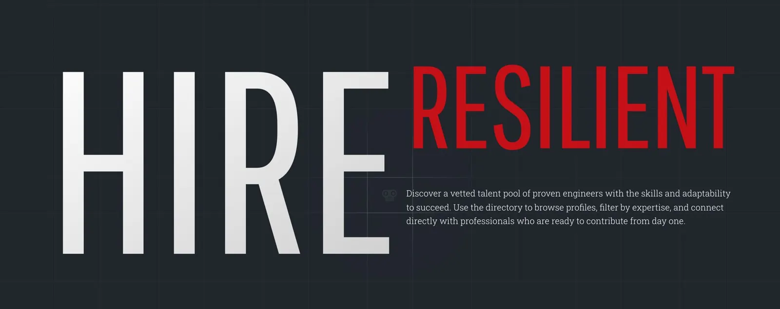
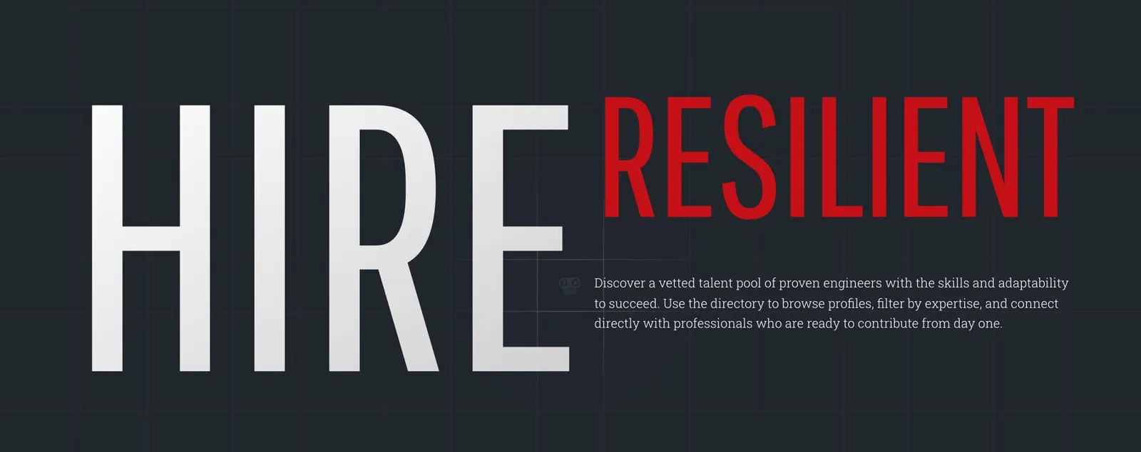
In production · HIRE / RESILIENT
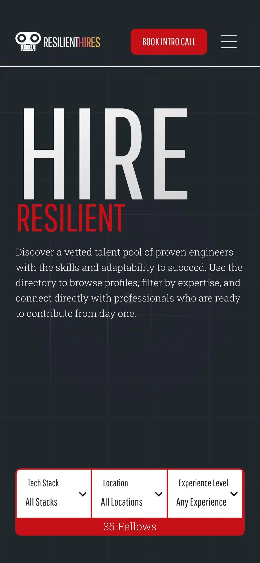
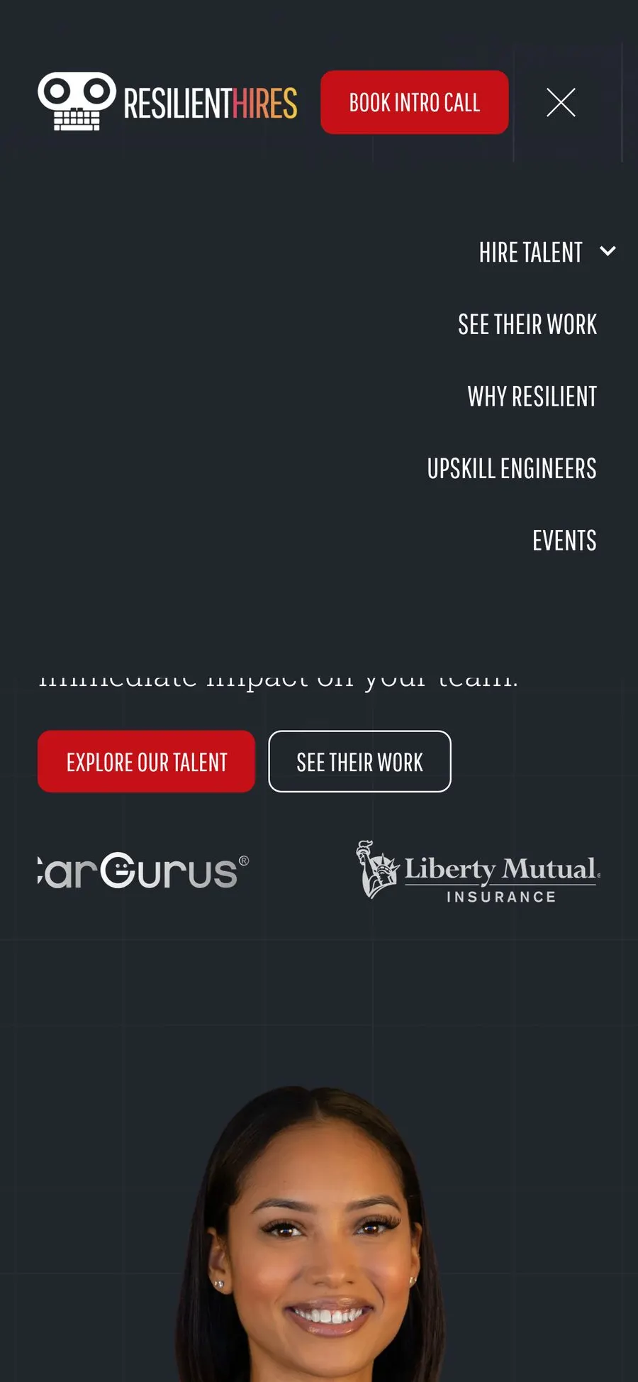
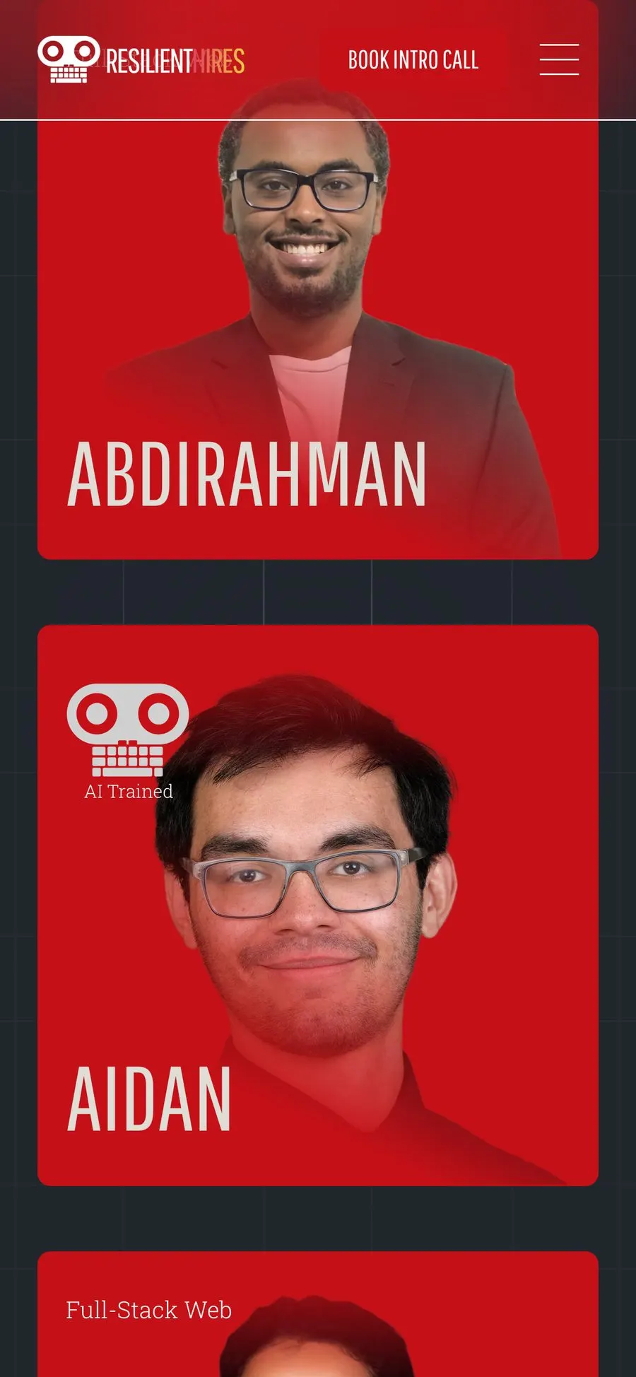
In production · Mobile 390
Same headlines, one column, nothing lost.
The big headlines scale down so they still fill a phone screen. The filter bar stacks into three menus with the live count beneath: 35 Fellows on the day we captured it. Book Intro Call stays in the header, one tap away.
Chapter 16 · Development
Launch and handover
We launched twice on purpose: quietly first, then loudly.
On December 2, 2025, the finished site sat in the team's own Webflow dashboard. By the next week it was live in a soft launch, and the team worked through a short bug list in production. The public announcement went out with the January 2026 newsletter.
That was the operations lead's call, and it was the right one. Real visitors found small problems before the big push: a slow column, a testimonial button that reloaded the page, a broken footer link.
Support through the holidays
We stayed close after launch, working through the short bug list with the team until the public announcement went out.
Documentation, not a training day
Written guides and short videos for adding a fellow, a headshot and an event. The team chose to read them before booking the training they'd asked for.
What we added after launch
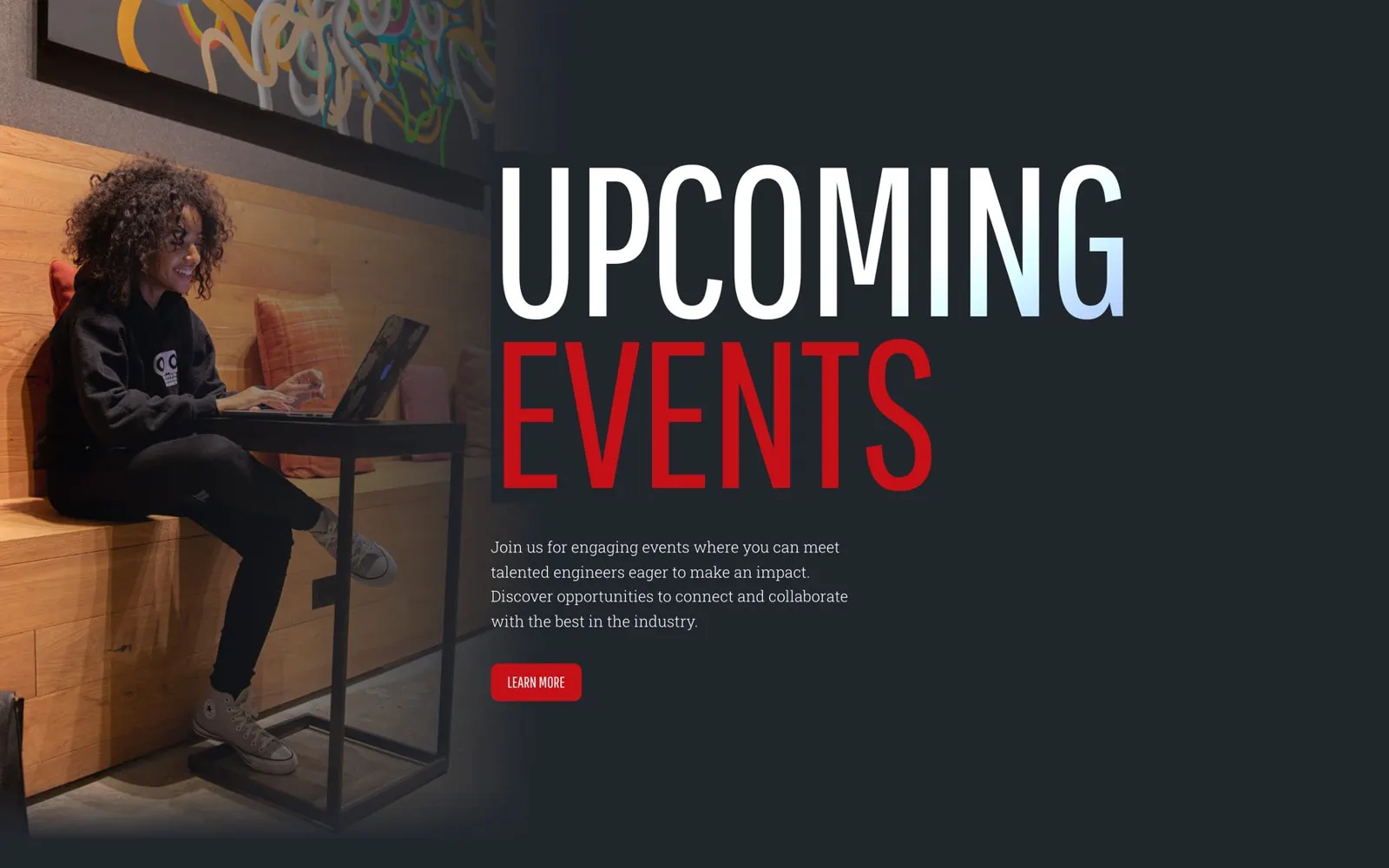
A Demo Day page, a Recently Employed row, a second events collection for workshops, and a contact page people can link to.
A real face in the hero
The launch portrait was AI-generated, and the team never loved it. In March 2026 an alum's photo replaced it.
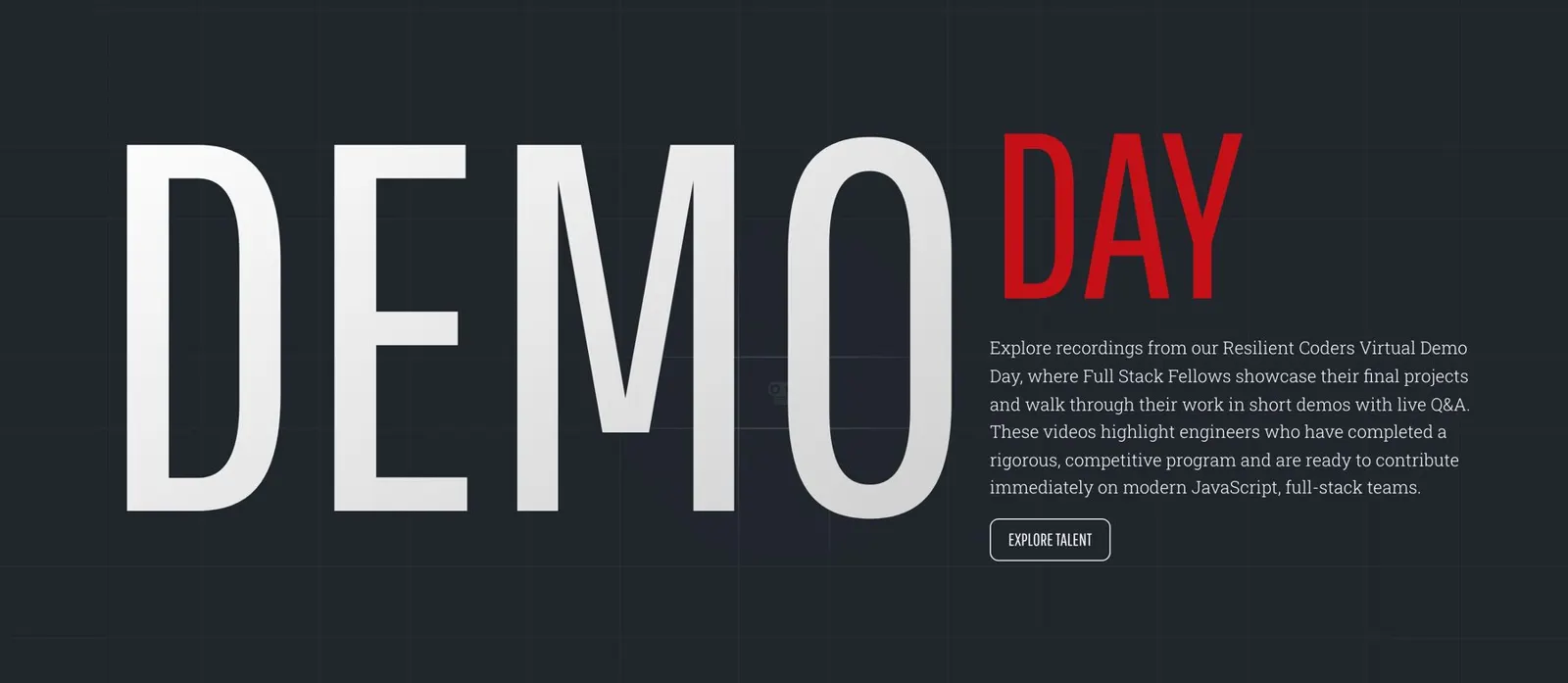
In production · the Demo Day page, added after launch
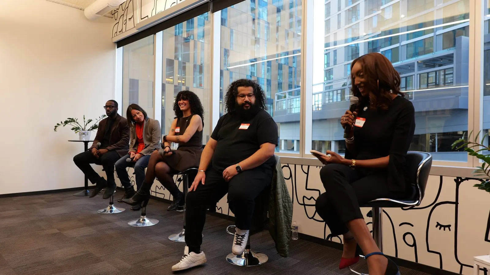
Handover
The test of a handover: can the team add a fellow, an event and a case study without us? By February they could.
Chapter 17 · Development
The major decisions
A few decisions shaped almost everything that followed.
| Decision | Why |
|---|---|
| Build a second site instead of fixing the first | It removed the nonprofit framing at the source, instead of asking partners to look past it. |
| Stay on Webflow, with a naming framework | The team already ran it and partly knew it. The framework made it something they could grow. |
| Use HubSpot forms, not Webflow's | Webflow's forms are simpler, but the sync had failed before. A reliable lead beat a prettier form. |
| Give every fellow a full profile, and keep the directory open | A card can't carry a match, and a login wall contradicts the pitch. We protected privacy in the fields instead. |
| Manage the roster from a spreadsheet | Fellow logins were possible. A sheet the team already kept was faster to ship and easier to trust. |
| Show fellows by availability, not cohort | Cohort rules hid alumni and broke case studies. One checkbox lists anyone, from any year. |
| Give Events its own spot in the menu | Tucking it under Hire Talent was tidier, but events are how partners first meet the fellows. |
| Use plain switches instead of clever rules | Filtering Demo Day by "has a video" broke as content changed. A switch the team flips never did. |
| Put a real alum in the hero | The generated portrait was fast. An alum's photo is proof. |
What we chose not to build
A password-protected roster. A Calendly link per fellow. A live calendar on the training page. Decorative icons in the hero. A testimonial slider that fought with HubSpot. Fellow logins, for now.
The system, extended · 2025 Annual Report
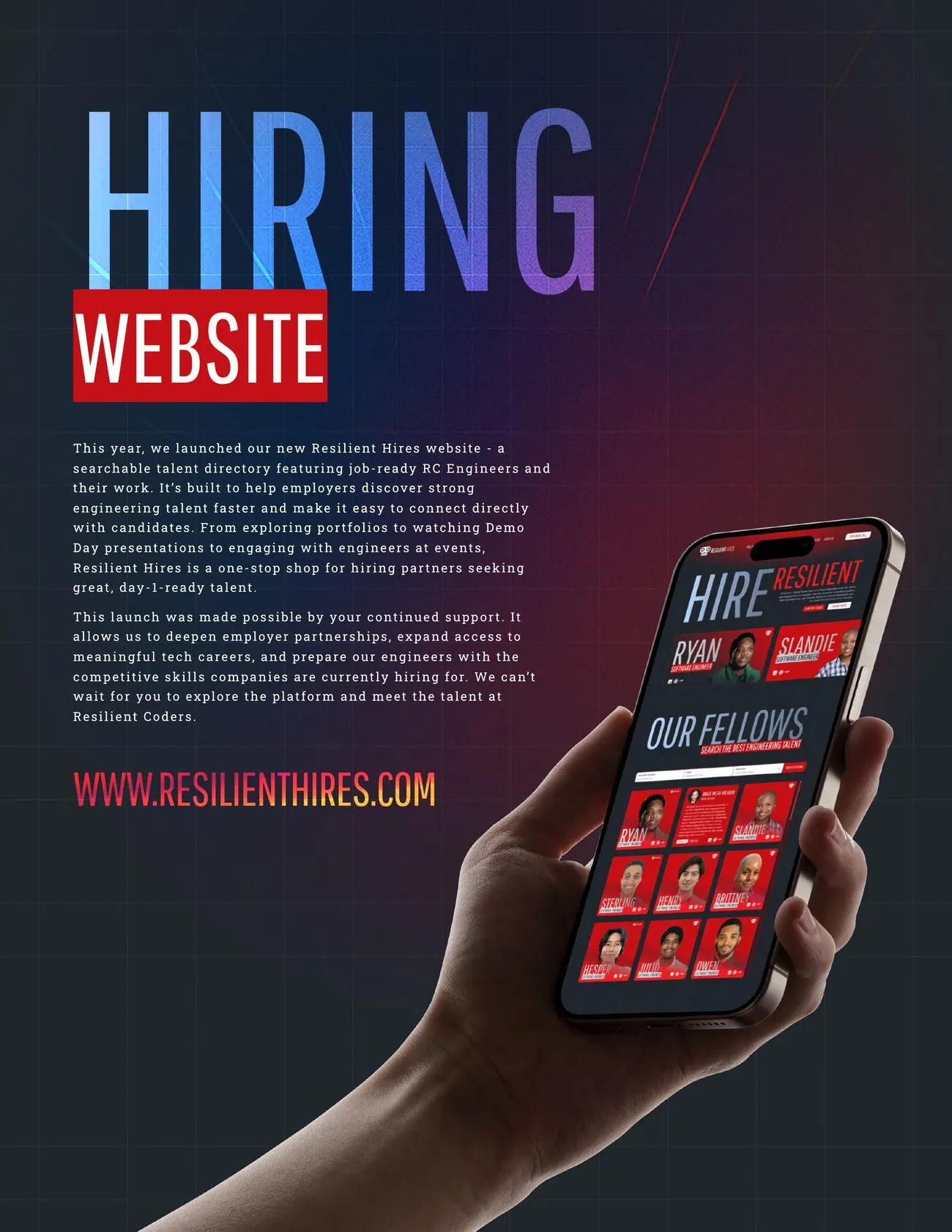
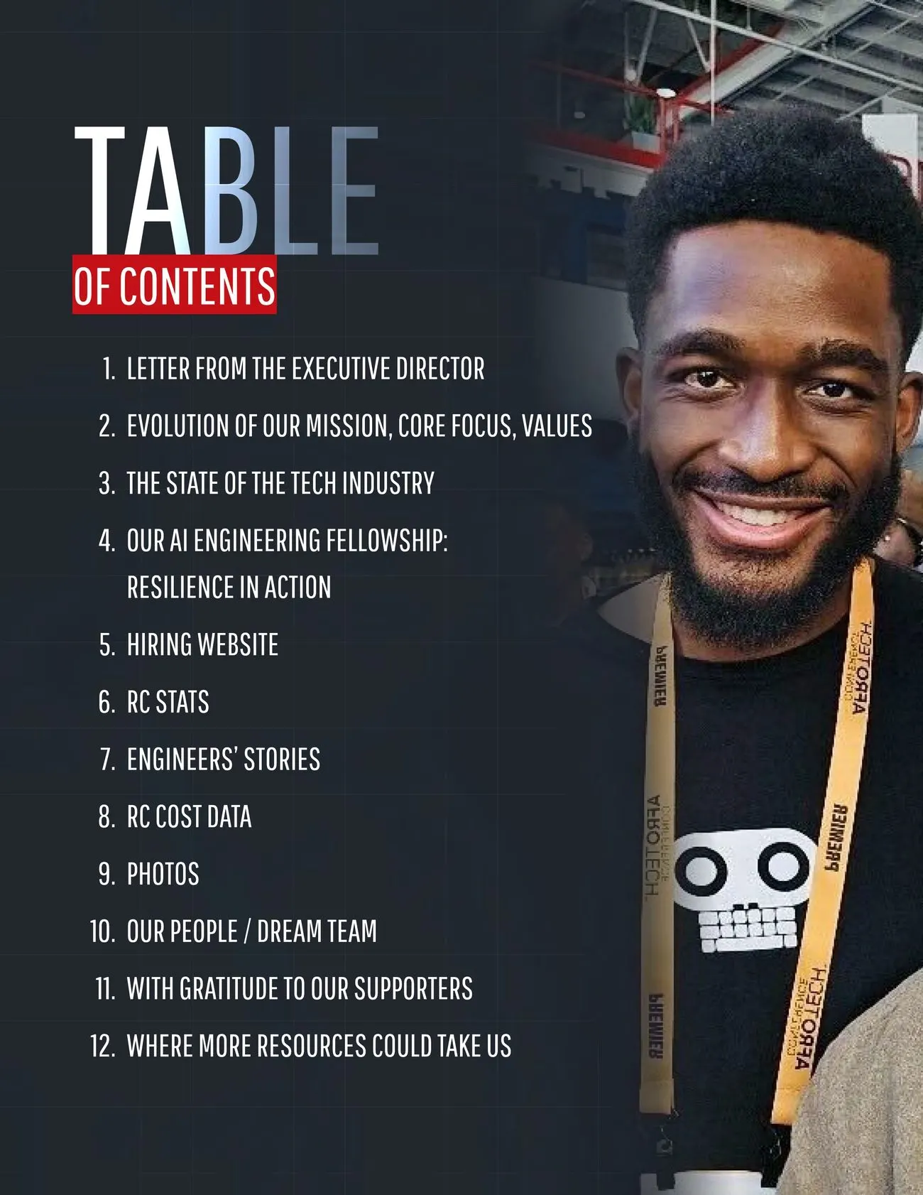
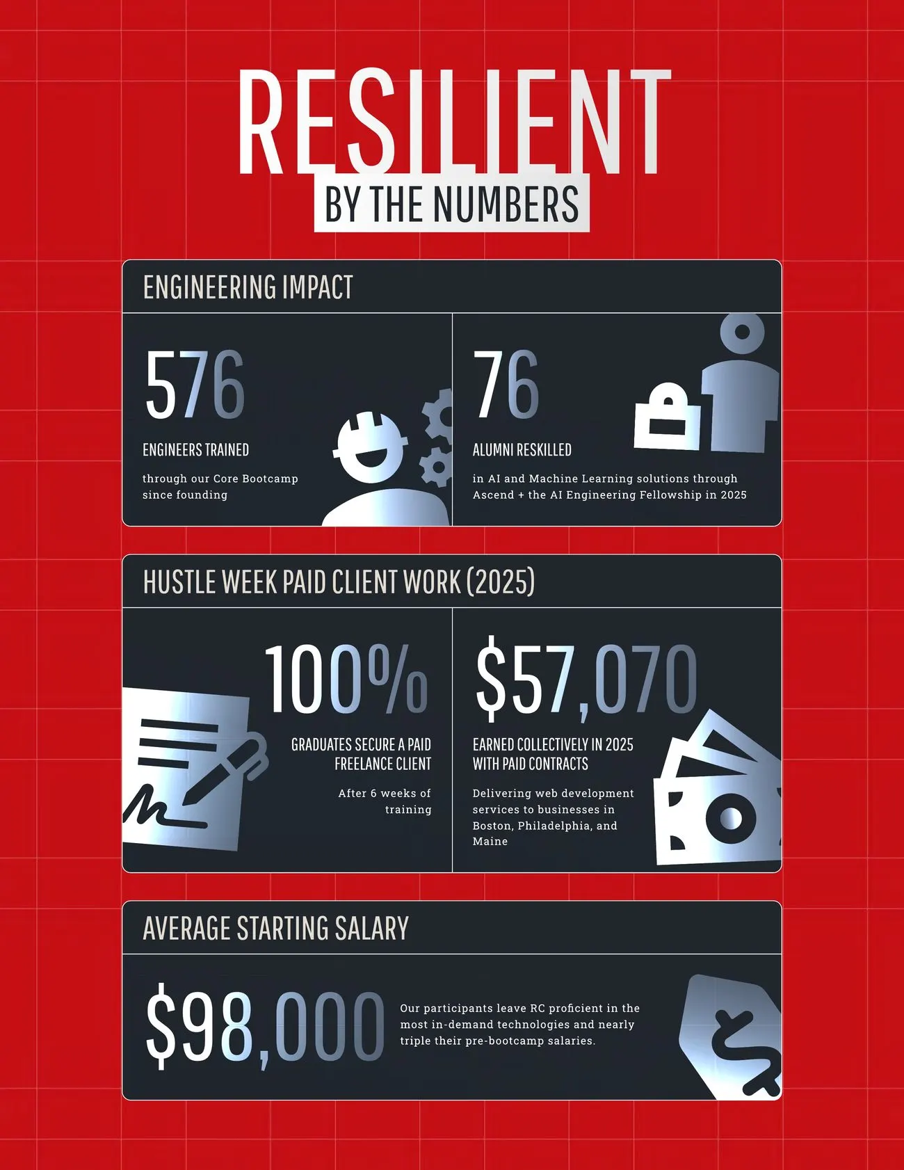
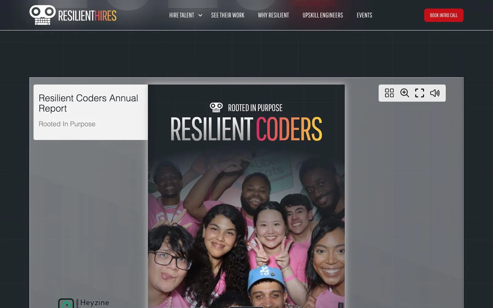
The brand didn't stop at the site. It went to print.
Two months after launch, the development team asked for their first annual report since 2021, in the look of Resilient Hires. We carried the same headlines, grid and red-on-dark rhythm into 33 digital pages and 36 for print.
The full story · Technical white paper
Resilience, in print.
How the look of the hiring site became a 33-page report, a 36-page print edition, and a flipbook. 23 pages · PDF · 14 MB
Chapter 18 · Results
What shipped
Twenty weeks from kickoff to a soft launch, then a public launch in January 2026.
Resilient Hires runs on the platform the team already had, and they have been growing it on their own since.
35
fellow profiles live, with 6 case studies beside them.
8
content collections the team updates without a developer.
5
HubSpot forms. Every inquiry lands in the CRM.
| Area | Before | After |
|---|---|---|
| Positioning | One nonprofit site spoke to students, donors and employers at once. | A talent network on its own domain speaks only to people who hire. |
| Directory | The roster was a page on the .org that was hard to update. | Partners filter fellows by stack, city and level, and open full profiles. |
| Inquiries | Contact forms weren't tracked, and bookings went to personal calendars. | Five HubSpot forms feed one CRM, and each booking names the fellow. |
| Content | Updates waited on instructors who were busy teaching. | The team adds fellows from a spreadsheet and publishes events alone. |
| Visual system | The old site was a purchased template. | A bold system of headlines, grids and components, reused in print. |
| Brand | Resilient Coders was read as a cause. | Resilient Hires, powered by Resilient Coders, reads as an advantage. |
What we're measuring next
Intro call requests and event RSVPs in HubSpot. How partners use the filters and how deep they go into profiles. Page speed on the directory. Searches for the Resilient Hires name. Hires that trace back to the site.
We publish numbers when they are real, never before. A new website doesn't automatically mean more hires. Until the CRM data builds up, this page stays on what shipped.
In production · resilienthires.com · the talent directory
A talent network the team runs themselves.
Chapter 19
What we learned
The headlines were the hardest part.
Not the CMS and not the forms. A title that has to be huge, blended and animated on every screen is an engineering job dressed up as typography.
Content set the schedule.
Copy arrived in September, the roster in November, the logos in March. We built pages that could launch half-empty, and that is why the launch held.
Plain switches beat clever rules.
Every rule that guessed from the data eventually broke. Every checkbox survived. The team clicks one more box and nobody calls us.
A real face beat a generated one.
The AI portrait shipped because it was quick. It never felt right. Next time, photography is part of the scope from the first day.
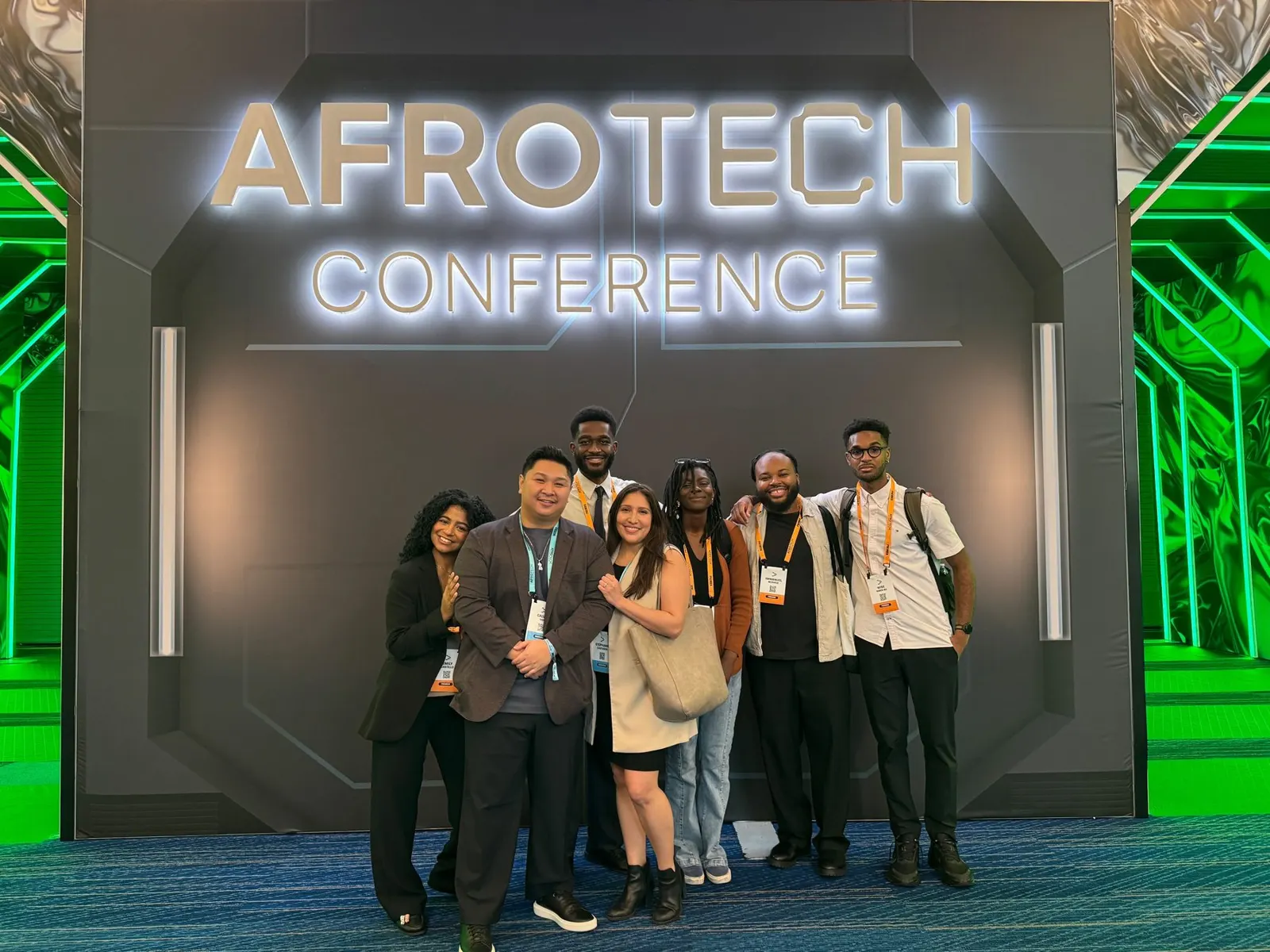

The strongest result wasn't a new look. It was a hiring manager meeting the engineers first.
Resilient Coders now has a talent network that shows the people before the story, puts a conversation one click away on every page, and grows each week without a developer in the room.
Resilient Coders · resilienthires.com · launched January 2026
View live siteNext case study